
Why Your Brand Needs a ‘Brand Book’

Transcend Ideas - Brand Book

In today’s competitive business landscape, establishing a strong and consistent brand identity is crucial for success. One effective tool that can help you achieve this is a ‘Brand Book.’ If you’re unfamiliar with this concept, don’t worry – you’re not alone. Many brands and businesses have yet to create one. However, investing time and effort into developing a Brand Book can save you valuable resources in the long run and significantly boost your organizational efficiency.

As we enter 2024, it’s the perfect time to prioritize organization and streamline your brand.

What is a Brand Book?

Brand book - photo stock

A Brand Book is a document or file that concisely captures and visually presents the key characteristics of your brand. It serves as a centralized resource containing essential elements such as logos, alternative logo versions, brand icons, fonts, color palettes, taglines, and other distinctive traits specific to your brand. These resources are valuable references when creating various materials for your business, acting as a personal recipe book for maintaining brand consistency.

Why Does Your Business Need to Define Brand Guidelines?

Brand consistency is key to building a strong and recognizable brand. A Brand Book plays a vital role in achieving this.

By having one, you can ensure that all branded materials created throughout your business’s lifespan adhere to a consistent visual and tonal identity. It also facilitates collaboration with external partners, such as graphic designers and writers, by providing them with a clear framework to work from. This not only saves time but can also reduce costs. Additionally, having all the components of your brand compiled in one place fosters a shared understanding of your brand’s essence among everyone involved.

How to Make a Brand Book

If you have a professional designer working on your logo and branding, you can request a Brand Book as part of their deliverables. However, if you haven’t done so, don’t worry. Creating your own is entirely feasible, regardless of your brand’s stage of development.

The preferred format for a Brand Book is a portfolio-style packaged PDF. The length will depend on the unique characteristics of your brand. It could be as concise as a single page or extend to dozens of pages. Consider including the following brand information:

  • Cover
  • Table of Contents (for larger organizations)
  • Brand History
  • Who we are
  • What we do
  • Mission
  • Values
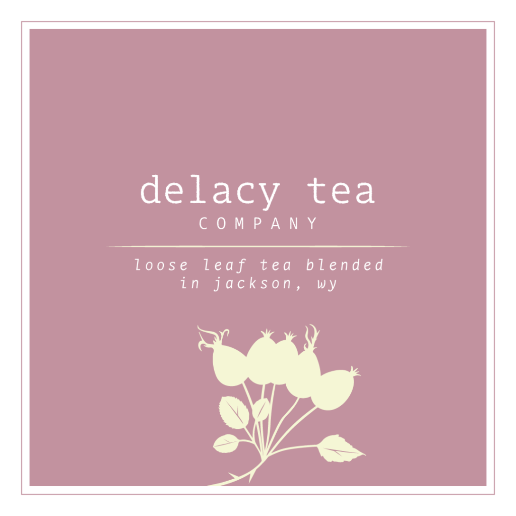
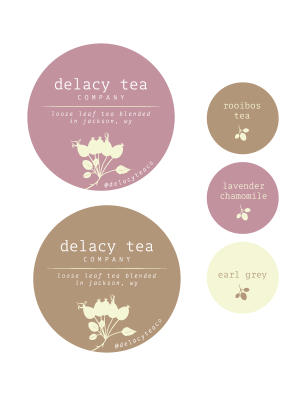
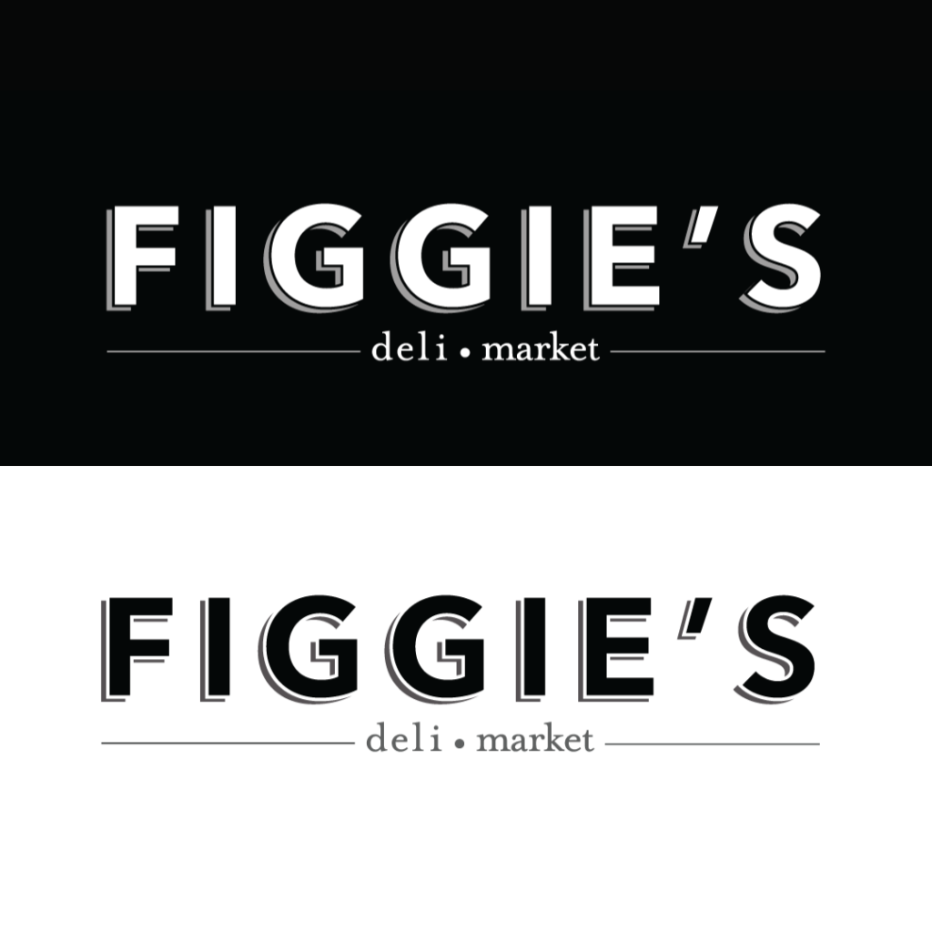
  • Logo and its different variations (refer to this helpful resource for guidance on what to include in your logo package)
  • Icon
  • Color palette (include swatches of each brand color along with their RGB and Hex codes)
  • Typography (primary and secondary fonts, including style variations like bold and italic)
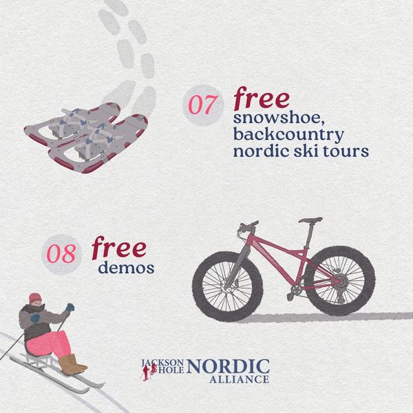
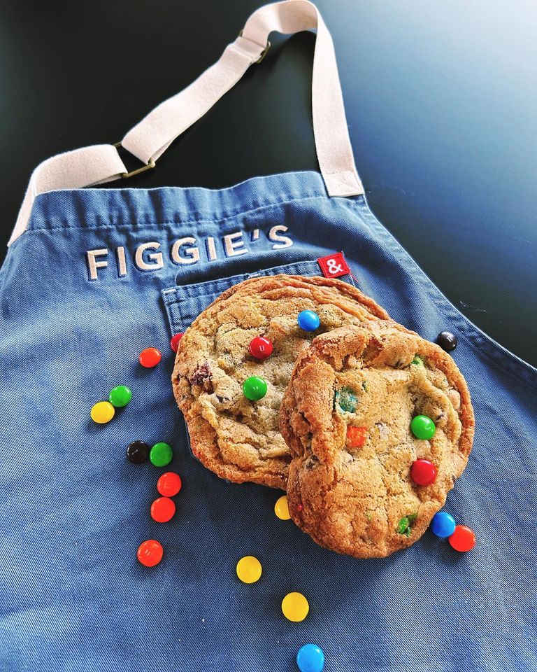
  • Photos that encapsulate your brand (could be presented in a mood board)
  • Voice (tone of voice for written deliverables concerning your brand)
  • Taglines
  • Website (including address)
  • Social media handles, platforms used, and potentially some information on your brand’s social media strategy

By investing time and effort into creating a comprehensive Brand Book, you’ll be equipping your business with a powerful tool for maintaining brand consistency and ensuring a strong and recognizable brand presence in the market.


Looking for support as you pull in items for brand identity? Reach out to our team for support today in creating a brand book!

JH Nordic Annual Event 2024 Case Study

Transcend Ideas is proud to continue our partnership with JH Nordic. We are proud to support their mission to improve winter trails access, education, and stewardship in the Teton. The Jackson Hole Nordic Alliance Annual Free Ski, Snowshoe, and Fat Bike Day event has become a favorite tradition for families and the community to come together to celebrate winter recreation in the Tetons. We are proud to have provided the illustration and marketing for the 2024 event this year.


JH Nordic Annual Free Ski, Snowshoe, Fatbike Day at Turpin Meadow Ranch

Transcend Ideas was proud to support the goal to provide education and increase awareness and community around winter trails use in the Tetons for visitors and locals alike.

  • Our team generated an illustrated vintage-style poster reminiscent of skiing and days spent on winter trails from the past. This appeals emotionally to viewers of both the physical and digital marketing campaigns.
  • Digital graphics were created for social media as a 10 day countdown to increase excitement and engagement online. A consistent digital presence promoting attendance at the 6th Annual Free Ski, Snowshoe, and Fatbike Day supported the success of the event.

Visit the JH Nordic website to learn more about all things winter trails and grooming in the Tetons.


Learn more about how Transcend Ideas can help with strategy and marketing behind your non-profits next big community event!

Colors Have Meaning

A large component of brand identity and discovery is choosing the color palette. Colors have meaning and some that we gravitate towards are quite a subconscious choice.

For Transcend Ideas, we utilized; 

  1. Beige: unification
  2. Brown: stability
  3. Blue-green: calm, service

If you ask us, that is pretty spot-on.

We found some beautiful hues in nature that also tell a story of the energetic embodiment different color palettes can provide.

See the following link to describe Symbolism in colors

Colors in Nature
Image of moss growing on a rock and associated color palette

Brand Identity Process

When we begin working with a client on brand identity we first enter into discovery, read more here. After discovery, you enter into the logo variations. We urge our clients not to enter colors just yet because it could influence the choice of the logo itself. You may have heard the term “make it pop” and it’s quite literally what varying colors do, bring life and richness to the brand. Palettes can have their own emotional response they elicit, blues represent trust whereas red can represent excitement or anger. Color evokes an emotional response and can often influence a subtle change in your feelings and perceptions toward a company, from merely a logo or brand campaign alone.

Colors in Nature 
Image of crossed logs and associated color palette

If you like our approach signup for our newsletter or email hello@transcendideas.com for any questions on how we can help.

Discovery – Brand Identity

Discovery is simply that, discovering what your brand could become.

A vital component of this exercise is to uncover the personality of the brand. Would you like their personality if the brand were a person? Could you be friends? Does your first impression make you want to do business with them? Why?

Starting with a list of traits and action words helps narrow the scope to make you think a bit before diving into the name and the logo mark. Use this opportunity to brain dump all of what you hope for your brand, including: phrasing associated with niche populations you’d like to reach, values, long-term goals, and aspirations for your business as you are starting to identify words and phrases you’d like to align with.

Transcend Ideas Discovery graphic

Building Identity for Transcend Ideas

For Transcend Ideas we went through a discovery as well and we certainly did not take it lightly. We brainstormed on words that conveyed growth and progression. We thought of words that went beyond ascension. 

Our words:

  • trustworthy
  • curiosity
  • nature
  • friendly, approachable
  • compassionate
  • inclusive
  • playful
  • simple, yet interesting
  • thoughtful
  • inspiring

Contact us for Business Discovery

Hopefully this approach will give you some ideas on how you’d like to approach your brand identity journey. Read more about what your discovery entails and email hello@transcendideas.com for any questions on how we can help. Want to get started on your business discovery? Fill out our client questionnaire at this link to get started!

Case Study: Wyoming Coalition for Animal Protection

Wyoming Coalition for Animal Protection - Wycap logo image

The Wyoming Coalition for Animal Protection (WYCAP) was looking for a logo design that helped represent their non-profit organization. WYCAP advocates for the species that cannot speak for themselves.

Final Concept Logo Design

Although there was debate on what species to include we did come to a compromise on which animals were represented from domestic, farm and native wildlife. The concept landed on a triangle shape to help represent the trifecta, or the categories of creatures they devote their advocacy to protect.

Color Palette

The logo uses a mid-tone blue and deep navy blue along with a golden yellow for the final concept. That lends the end user to feeling trust toward the organization. Golden yellow elicits feelings of a faithful, stable, and organized non-profit. The colors together bring in a strong combination that remains dedicated to protecting animals. The sense of calm and assurance you get from the use of colors aligns with the organization advocating for animals and others respecting rules and authority to reach their goals of preventing exploitation of all wildlife.

Designed with Gliffen Designs


Contact Transcend Ideas for your logo concept design needs today. Visit this link to set up a time to chat about your business needs. We’d love to work with you.

Case Study: Nom Nom Doughnuts

Nom Nom Doughnuts hand drawn logo

Client Request

Nom Nom Doughnuts company was looking for a hand-drawn logo to convey their mobile doughnut business. This little airstream makes donuts that are delightfully light with big flavor.

The company needed a light-hearted and airy design that would be eye-catching for the general bystander at concerts and events in Jackson and around western Wyoming.

Nom Nom Doughnuts Final Logo

Heather brought her illustrative expertise to this project. The hand-drawn effect of an airstream shows doughnuts of varying textures coming across the top of the vehicle in an arc effect. The use of color on this project was playful and vintage, lending to the vintage effect of the airstream trailer that they have revamped into a delicacy-baking food truck machine. The logo created represents the wide variety of doughnuts that could be purchased from their company. The airstream identity on the branding fits right in with the exploratory and laid-back vibe that many in the town of Jackson resonate with.

Location

You can find Nom Nom Doughnuts at concerts, community events, and all around the town of Jackson. Make sure to stop in and say hello to the team!

Designed with Gliffen Designs

Are you looking to hire illustration work for your business? Contact Transcend Ideas to discuss what you are needing for your business!