In today’s design industry, inclusive design has taken center stage as the prevailing approach. While not a new concept, its influence continues to grow as it becomes more mainstream. The reason behind this shift is clear: inclusive design empowers nearly everyone to engage in digital spaces.
In this post, we will delve into why adopting this philosophy is crucial and explore practical ways to incorporate it into your brand’s design work and digital content. Get ready to unlock the power of inclusivity and revolutionize your design approach.
Accessibility vs. Inclusive design?
What is accessibility? Accessibility in design aims to give people with disabilities access – but this is only the bare minimum for web access to today’s world. The focus is on following ADA compliance via section 508 or Web Content Accessibility Guidelines. Accessibility is essential but only the beginning of creating an inclusive digital space.
Inclusive design takes accessibility a few steps further. It‘s less concerned about simply meeting requirements and more concentrated on how every user can have the best possible experience. This requires designers to incorporate empathy (link Heather’s blog to the words incorporate empathy) and compassion into their work practice. Inclusive design considers a broad range of challenges that users may face and focuses on creating products that meet users wherever they are. It takes into account the diverse needs of users and aims to create experiences that are accessible and effective for everyone.
Why ‘inclusive design’ matters:
Inclusive design is crucial because it challenges and enhances good design without compromising aesthetics. It allows for a diverse audience to engage with your brand, promoting fairness and equal participation for all individuals. From a business perspective, inclusive design opens doors to potential customers and demonstrates social responsibility. Moreover, it encourages learning from diverse experiences, leading to innovative and user-centric designs. Inclusive design is not just about accessibility; it is about creating better experiences and ensuring equal opportunities for everyone.
Who might benefit from inclusive design:
The answer is everyone. Inclusive design benefits the whole for the better. After all, inclusive design calls on designers to communicate their messaging in the most effective and clear way possible.
However, inclusive design is crucial for ensuring that disabled individuals can fully participate in the digital world. When designing, it is essential to consider the needs of users with visual impairments, hearing impairments, limited motor functions, those on the neurodivergent spectrum, and others who may face barriers to access. By prioritizing inclusivity, we can create digital experiences that accommodate diverse abilities and enable equal participation for all users.
According to the CDC, approximately 25% of adults in the US live with a disability. Furthermore, it is expected that a significant majority of individuals will encounter a temporary or permanent disability at some stage in their lives. These statistics highlight the importance of inclusive design in order to cater to the diverse needs and experiences of individuals with disabilities.
How to make your design work inclusive:
To all fellow designers out there who might want to start incorporating inclusive design practices into their work, there are various elements of design to consider. Doing so will make digital spaces more welcoming and functional for more people. After all, design work is created for humans.
Contrasting colors!
When designers are intentional about choosing contrasting colors, it makes for an overall improved experience. Not only does it make digital spaces accessible for those who might be sight impaired higher contrast benefits the experience of all users.
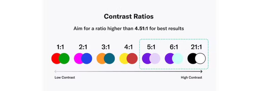
The Web Contrast Accessibility Guidelines (WCAG 2.0) requires a contrast ratio of at least 4.5:1 for normal text and 3:1 for large text. Contrast ratios can range from 1 (1:1) to 21 (21:1). To get the contrast ratio of two colors, this formula is used L1 meaning the lighter and L2 the darker; (L1 + 0.05) / (L2 + 0.05).
This formula can be confusing and thankfully there are many calculators available to check color contrast. Try testing on Coolors or Webaim. Other sites can help designers generate accessible color palettes like ColorSafe.
It is also a good practice for designers to avoid using pure black (#000000) and pure white (#FFFFFF). When pure black is used in design and as text color, it causes the eyes of readers to strain. It’s best to opt for a dark grey. (see example below)

Font choices matter.
Remember, most of the information that exists online comes in the form of text. You want your users to be able to comprehend and understand what your brand is saying.
Size: Keep the size of your text as large as possible. It is recommended that body text should be no smaller than 12px however a 16px body text is even more inclusive to those who might be sight impaired or those with reading disorders.
Typeface: The style of fonts is an important design decision. Some fonts are known for being more accessible than others. For example, in most cases, it is best to choose a sans-serif font for the body text. Fonts like Arial, Calibri, and Helvetica are good choices for body text. Save fun serif fonts for headings that will be presented in a larger text size.
Weight: This is another font characteristic that can help portray information with clarity. Added weight onto headers and sub-headers can create a visual hierarchy that can help organize information for the reader. This is particularly helpful for neurodivergent folks.

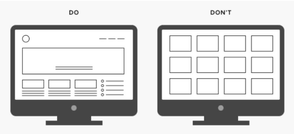
Layout is important!
As mentioned above, visual hierarchy is important. Intentional layout design can significantly improve the comprehension of information.
When bodies of text become too dense, it becomes harder for your entire audience to comprehend. It is recommended that line length should be kept to about 45-75 words long.
Incorporating visual elements is also a great way to enhance the readability of large bodies of text. Creating a balanced look in our work relies on visual hierarchy. We achieve this by using both symmetry and asymmetry in equal measure, ensuring a strong and visually pleasing stability.
Consider Functionality
This topic leans towards the development side of web design however it is important mentioning because functionality needs to be inclusive too. For example, a site that requires a user to hover for navigation is not inclusive design. It really isn’t accessible for anyone, especially those users with motor-related disabilities.
Visual and Audio Processing
People process visual and audio information across a broad spectrum and it is a designer’s job to be aware of this.
Color choices: Selecting suitable colors involves more than just considering contrast; there are additional aspects to keep in mind. For instance, individuals on the neurodivergent spectrum may find intense and vibrant colors overly stimulating and distracting. By opting for clean and simple colors, these issues can be alleviated, leading to more effective information communication. Taking inclusion a step further, offering a dark mode option for your theme can enhance the user experience and make it more enjoyable for certain users.
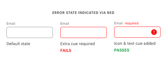
It is important to remember that color should not be relied upon to convey messages. If a design is not easily discernible in grayscale, it lacks accessibility. Developing the habit of reviewing design drafts in grayscale can ensure inclusion for colorblind users and improve overall accessibility.
Alt text: Ensuring that every image incorporated in a digital environment is accompanied by an alternative text description serves two important purposes. Firstly, it allows users with visual impairments to comprehend the content, and secondly, it contributes to enhancing search engine optimization (SEO).
Audio inclusion: If there is video or audio content available in a digital space, it should be paired with either closed captions or a written transcript to be inclusive to all users. Also, it’s best to skip any auto-play features or just mute any content by default. Whether it’s to accommodate individuals facing sensory overload, hearing impairment, or simply those in quiet environments, being mindful of audio enhances accessibility. Design choices that prioritize audio inclusivity can make content accessible to a wider range of people in various situations.
Inclusive Content
To create inclusive digital spaces, it is crucial to make accessible design choices and also consider the content. Users have varying reading abilities and English may not be their first language. To ensure easy access to information, it is best to use simple words and keep things concise.
Creating inclusive content also involves recognizing the importance of having a diverse team of content creators. By incorporating individuals from various backgrounds, perspectives, and experiences, a wider range of voices can contribute to the content production process. This diversity allows for a more accurate and authentic representation of different communities, resulting in content that resonates with a broader audience
Additionally, using supportive language with readers helps foster a positive connection. Try, “Thanks for reading this far. I appreciate your interest in inclusive design. You must really care about the people you design for :)”
Center Disabled People
Disabled individuals have played a significant role as pioneers of inclusive design, yet they haven’t received the recognition they deserve. Their contributions and insights have been instrumental in shaping and advancing inclusive design practices.
‘Crip Technoscience’ is the concept in disability studies and design that centers disabled people as makers and inventors. Two prominent disabled activists, Alice Wong & Aimi Hamraie, discussed this topic in detail on the Critical Design Lab Podcast.
“Non-disabled culture doesn’t recognize us as makers, a lot of the time they don’t recognize that disability culture is full of makers, and people who are expert tinkerers and hackers. And because of that people tend to think about disability in solely medical terms,” Aimi Hamraie
Inclusive design is not just for disabled folks. It improves the digital space for everyone. Disabled folk should be respected for their contributions and viewed as leaders within the inclusive design space.
Adopting inclusive design standards has become the norm in the industry. Embracing these practices not only improves design but also expands accessibility to a wider range of users. And adhering to inclusive design principles does not restrict us as designers; instead, it allows us to create better experiences for all.