I was in a Clubhouse room called: “Old School Marketing” and it blew me away how important going back to basics in your marketing truly is. Check out the next set of audio rooms I will be hosting on this very topic in the coming weeks. In the meantime here are some ideas to stew on..
Traditional Marketing Ideas:
In no particular order of course, but consider these ideas to implement:
- Word-of-mouth
- Schedule a cup of coffee or lunch with a work colleague, even your competition to discuss business
- Mailers
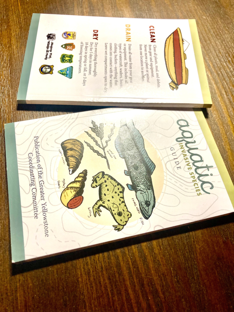
- Handouts (flyers, rack cards, business cards)
- Pin up in bulletin boards! – Make a list of these locales that accept those physical marketing tools
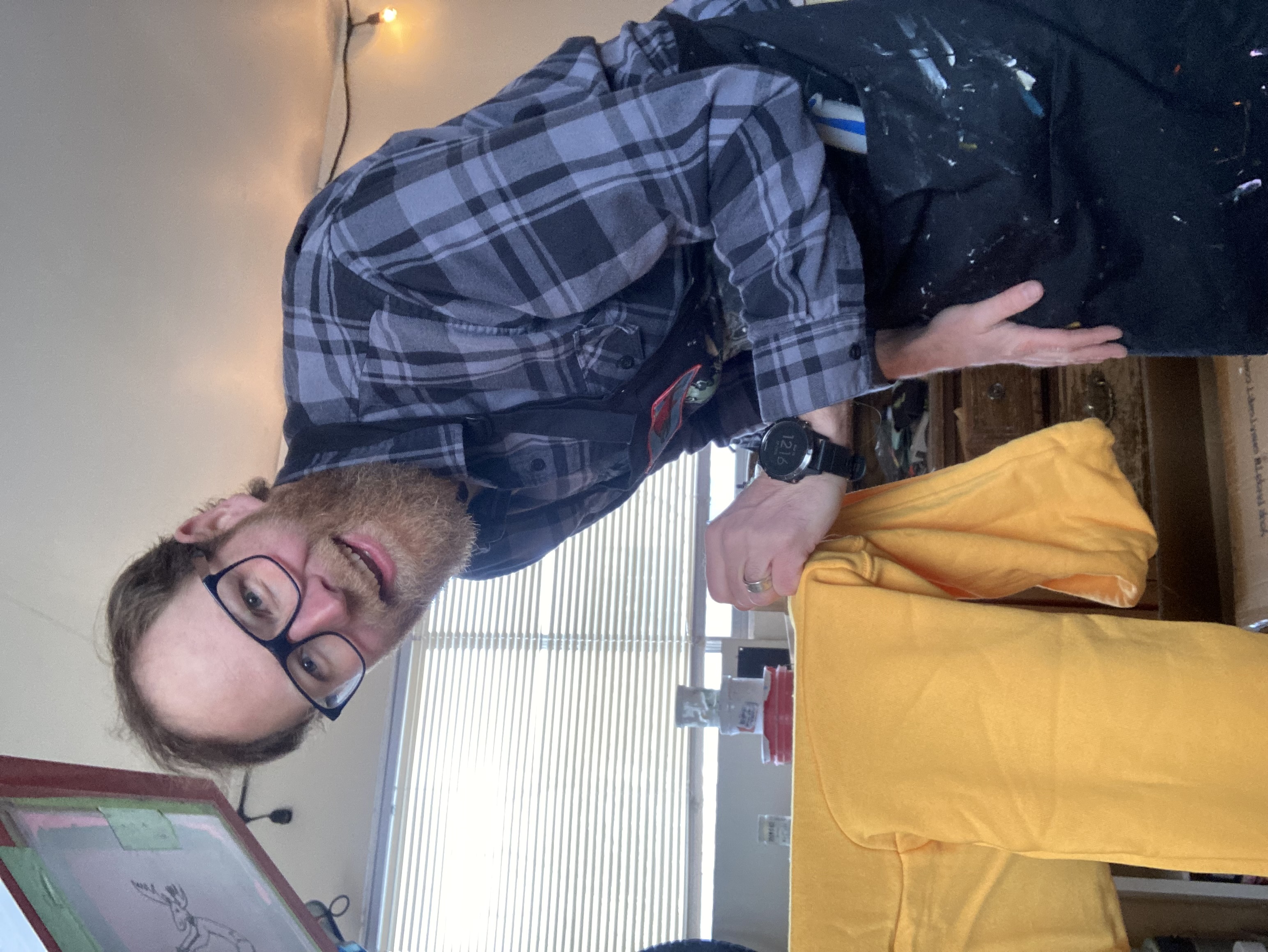
- Stickers (clever approach – catchphrase, coolness)
- Showing support for a charity/nonprofit organization
- A certain % of sales goes to charity in a certain time frame
- Sponsor an event or a sport in your town/city
- Join the Chamber of Commerce – make connections, take advantage of ALL they offer you!
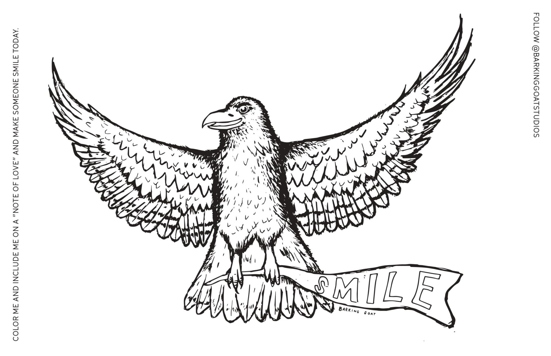
- Contests for all ages (art, name mascot, etc.)
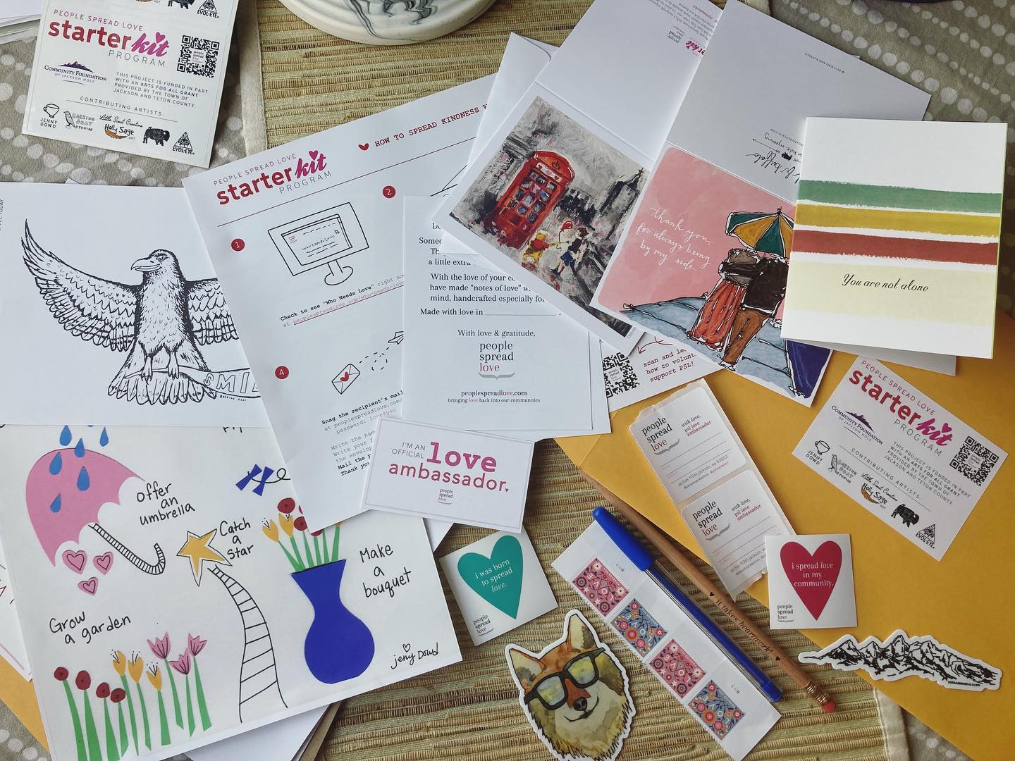
- Handwritten thank you notes
- Thank you gifts for your bigger clients
- Exclusive sales to your most loyal customers
- Holiday cards
- Networking
- In-person events – Hold in-person workshops (educate, inform, engage – build trust)
- Community calendars for events you are hosting
- Print ads in local newspapers
- In-store signs (sandwich boards)
- Takeaways: Bumper stickers, stickers, branded water bottles
- Name tags – custom name tags, wear your logo and name (perhaps pronouns too) to remind people what you are about!
- Movie theatre ads – Slides or videos of local businesses
- Post-it notes – custom couple with your business card (good leave behinds)

Photo by Marissa Grootes on Unsplash
“Create social proof through that localize medium!”
Heather Cox

“Tried and True” Marketing Ideas
Going back to the “tried and true” methods of marketing can be just what you needed to revitalize your connection with your audience. I am all for digital marketing, it’s predominately what I do but there is something to be said for that personal touch to make a connection. When we build relationships we are developing trust and communicating and we can’t always lean into digital technology to do that.
These marketing ideas are meant to be approached “in tandem” with digital marketing! Don’t discount the basics and ask yourself what you can you use in Q4 and what could you utilize in your marketing strategy for 2023.
Join the Traditional Marketing Ideas Conversation
Join Heather for a Clubhouse Room AND Twitter Spaces on “Old School Marketing Ideas.” All conversations will be recorded so you can listen in at a later time to learn a bit here and there. We will not be focusing on digitally marketing.
Clubhouse
“Old Skool Marketing for Biz and Nonprofits”
Wed, Oct 19th at 11:15 am MDT
Twitter Spaces
“Old Skool Marketing”
Wed, Nov 2 at 11:30 am MDT


