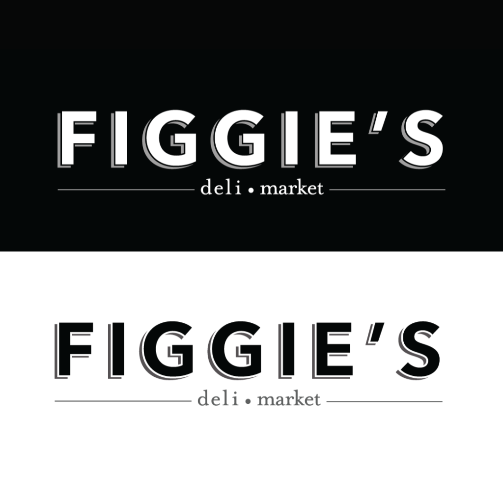
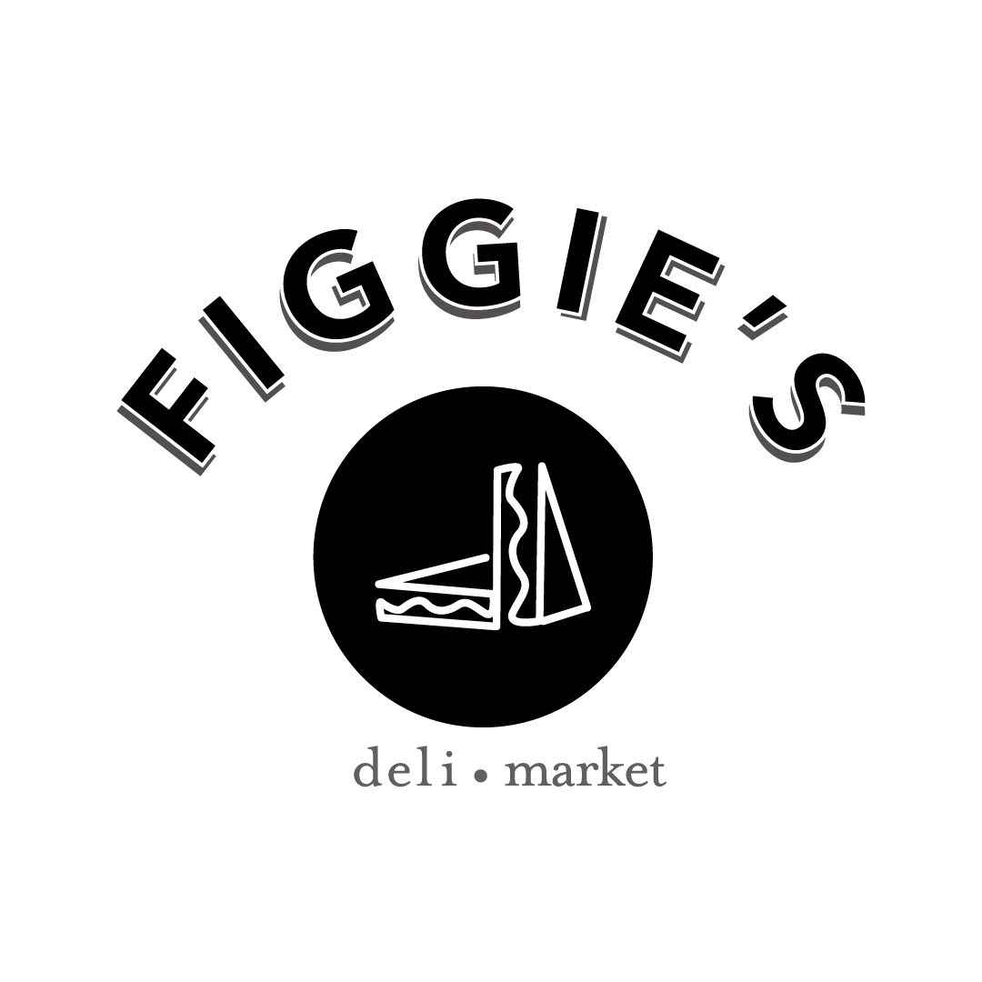
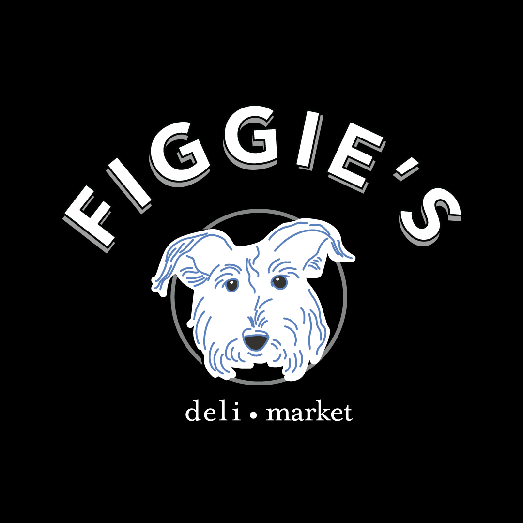
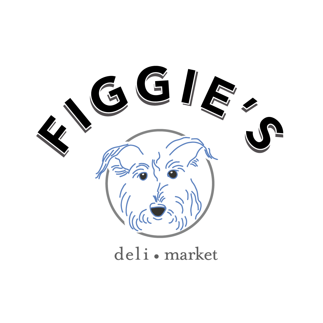
Figgie’s came to Transcend Ideas for help on a brand new logo for their deli and market in Driggs, Idaho. What they wanted to achieve was a simple approach with black, white and bluish-greys.
Deli and Market Branding
Figgie’s is looking to open in August 2022 with sandwiches to begin. And throughout the evolution of the restaurant, a market for residents to pick-up items for their convenience and ready-made meals.
Must Love Dogs
The owner’s love for dogs comes out in this third variation of the logo with their dog’s hand drawn portrait. Figgie’s is in fact the name of their sweet terrier. His sweet eyes gaze right at you and draws you into his cuteness and into the doors. This rescue dog, Fig is an affectionate dog pal and in a large part of why the owner loves to support animal rescues. They also envision portraits of local animals on the walls and plans to continually support Teton Valley animal rescue organizations.
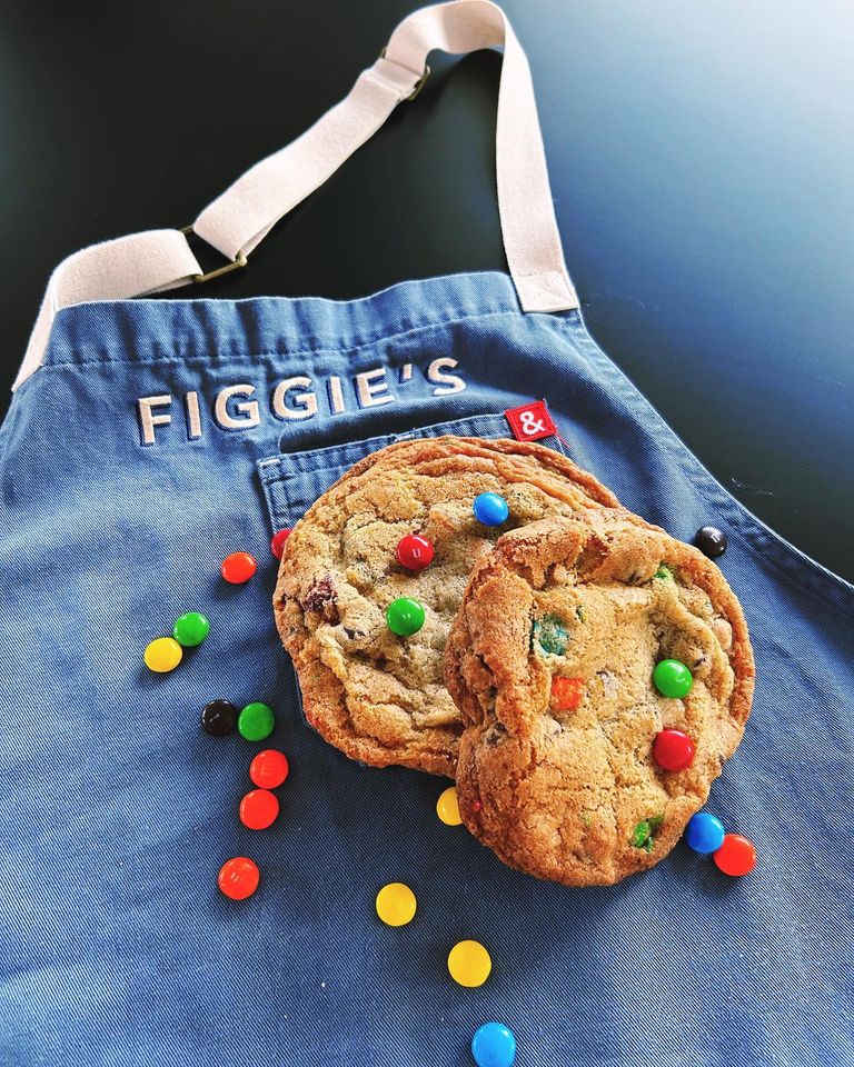
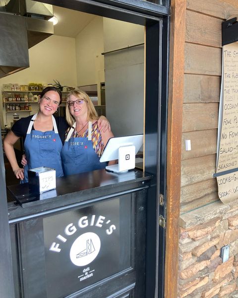
Hannah McClellan (left) and Carol (right) are rocking the sando lunch rush! Hannah opened up Figgie’s Deli just weeks ago in Driggs, ID.
Crazy for Food
Figgie’s Deli & Market opened last month! My favorite sandwiches so far: Robear and The Stallion
I love helping friends!
Find them here: 528 Valley Centre Dr Unit 4 in Valley Centre (across from Teton Valley Historical Museum) Open M-F / 11 am – 2 pm
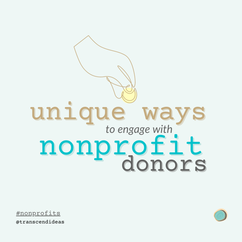
I love helping nonprofit organizations with their marketing strategy and implementation. I have 15 years experience working with nonprofits and here is a peek into why I am so keen on helping them. Find unique ways to engage with non-profit donors.
Why my Heart is into Helping Non-Profits
Nonprofit organizations are unique manifestations of good ideas that serve communities. Here in the Teton County, WY/Teton County, ID area we have over 400 nonprofits serving this region. Organizations do so much to serve the community’s needs in ways that government agencies and for-profit companies can not. The important work that nonprofits provide sparks a lot of motivation in me to serve them.
Founder of People Spread Love
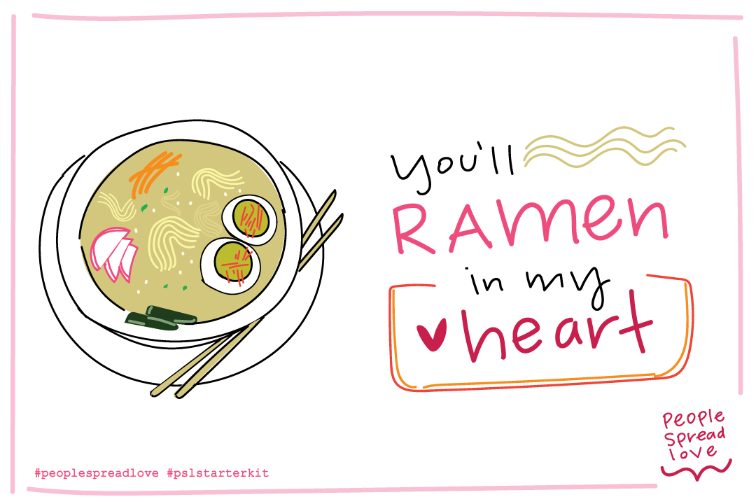
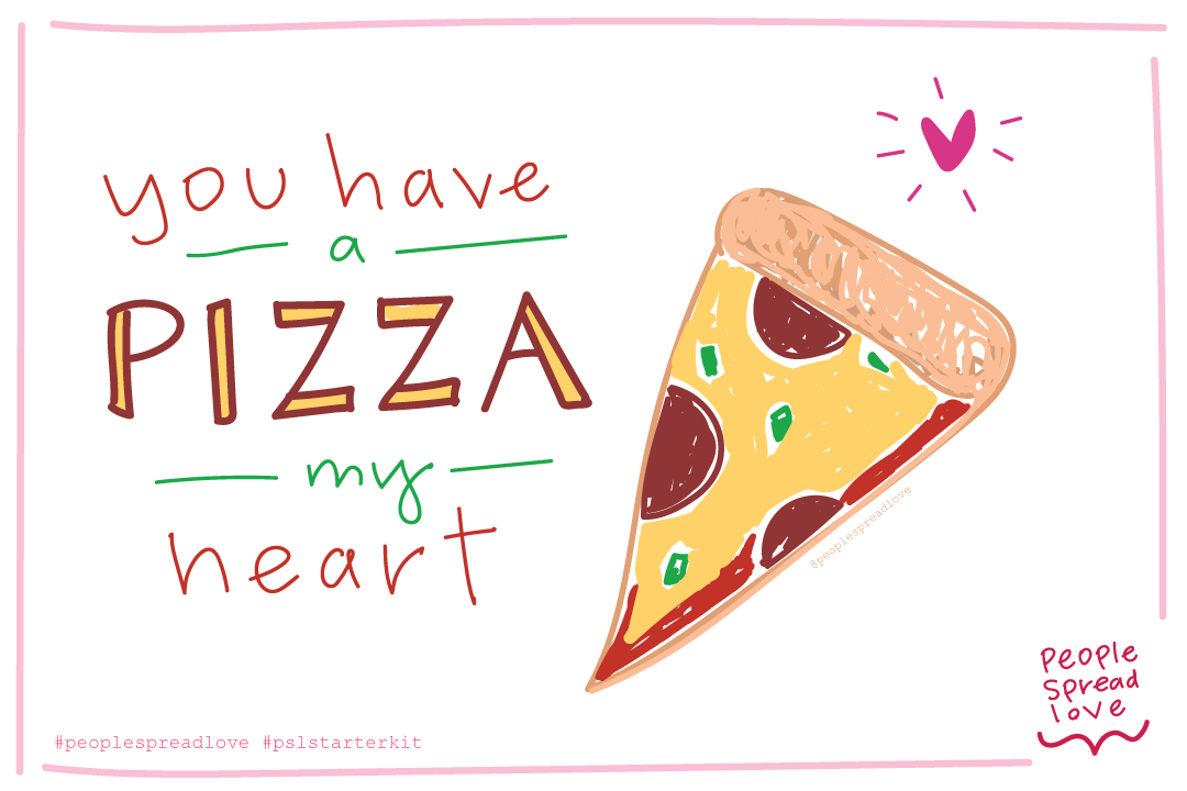
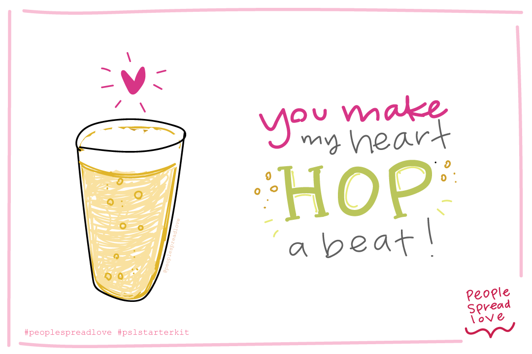
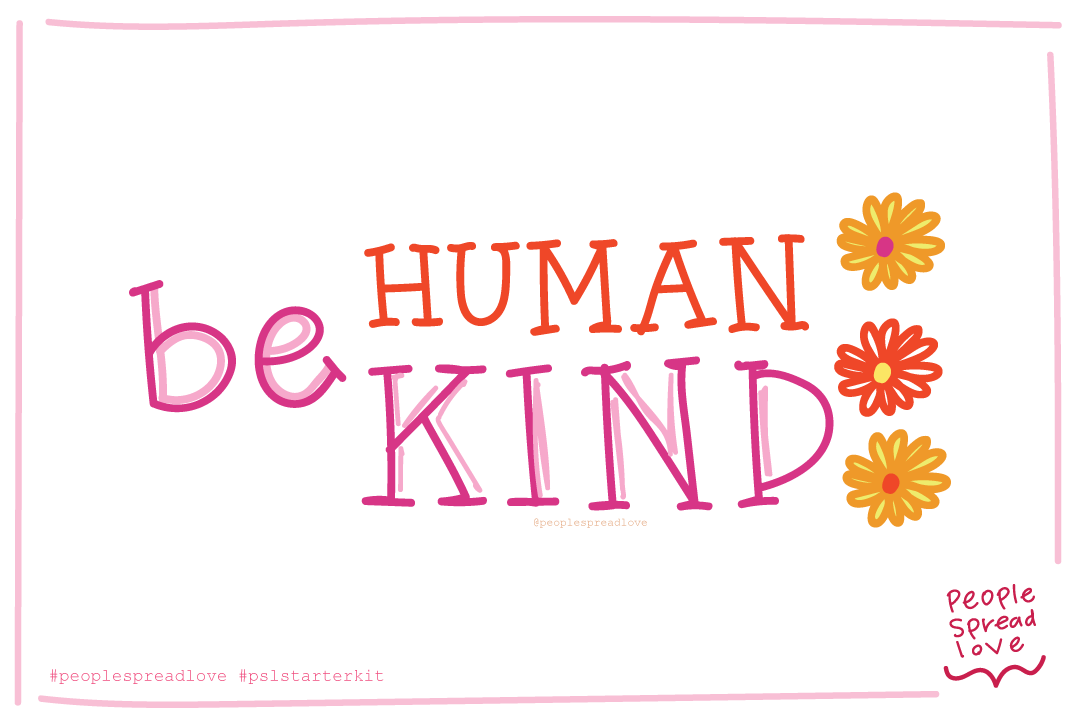
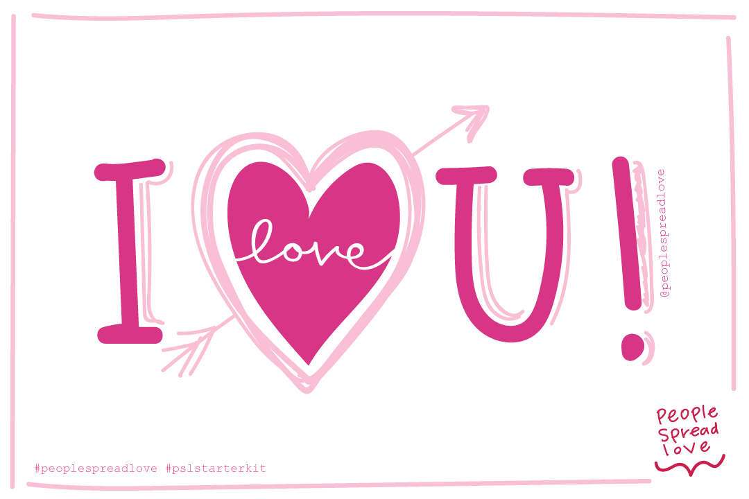
I founded a nonprofit, People Spread Love nearly 7 years now. The mission of People Spread Love (PSL) is to empower communities to write notes of love to those facing adversity. This act of kindness expresses empathy and revives human connection across community lines. PSL had very humbling beginnings, very grassroot style with compassionate volunteers at the helm. This 501c3 nonprofit organization is now stepping into a new phase with funding our very first People Spread Love Starter Kit program. This is an exciting time for me and my Board of Directors and for the community that has loved and supported us for many years now. As part of the Starter Kit program, I put together these clever and fun hand drawn postcards to be included in the kits and as a way to entice our donors to donate to PSL’s operational costs.
Hand Drawn Postcards for LOVE
Like many nonprofit organizations there is a need to engage with donors in unique ways. This angle is a creative one. As Galentine’s Day, Valentine’s Day and Random Acts of Kindness Week is right around the February corner, I thought it wise to release these designs in late January to get a jump start on getting these into the hands of our donors. I put the postcards up as an incentive when donating a certain amount to PSL. I’ve priced the postcards as a way that was less expensive than a greeting card you would already buy from a shop/grocery store (those suckers are nearly $5-8 a pop these days – yikes!). This example of an incentive is a practical one, away to reconnect or express love to someone you care about.
Printed Products are NOT Dead & Gone
The dilemma these days is our world revolves around being online, Zooming in, and always being tethered somehow through social media. This separation from that world into the physical written word is a relief for many. This is one of many reasons that PSL is so effective and easily adopted into our volunteer’s routines. When you are marketing your nonprofit do not give up on printed products, they are still very much appreciated and effective ways to reach your audience.
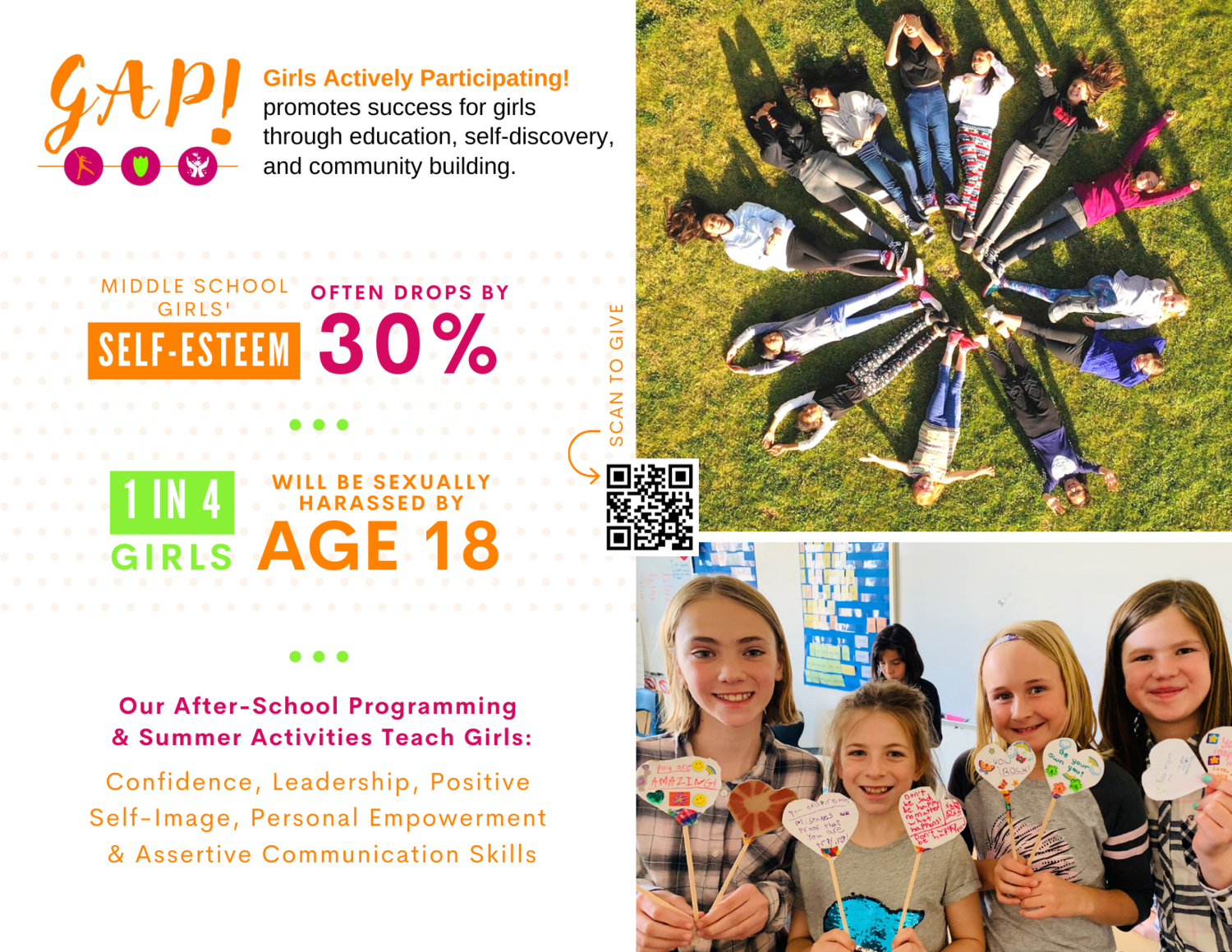
Capture their attention through a unique approach like humor. Since PSL’s premise is inclusion, love, kindness and generosity, a few good puns is a complimentary vibe. The example below is a postcard mailer I helped GAP! send to donors. The postcard presented the problem and the solution, this captures the attention of the donor and gives them the call-to-action (CTA) clearly in the middle of the postcard, the QR code they can “Scan to Give.” QR codes are back and more are utilizing it in the USA.
Ways to Engage with Nonprofit Donors
Direct mailer postcard from GAP!
Here are some other ways to engage with nonprofit donors;
Monthly emails with Carefully Crafted Content with very direct call-to-actions (CTA) ie. Campaign and goal communicated directly tied to a project or program.
Give them incentive to donate ie. Pun-ny postcards, stickers, etc.
QR codes are “in” now and work effectively to expedite the donation process.
Write and mail a “Thank You Note” – seriously that goes a very long way! Tell them what their gift went to better the community.
Share your impact story – collect testimonials of people have been directly impacted by your organization. This measurable helps your donors see the impact you make on the community.
Interested in learning more about different ways to engage with non-profit donors? Let’s get coffee to chat about other ideas.
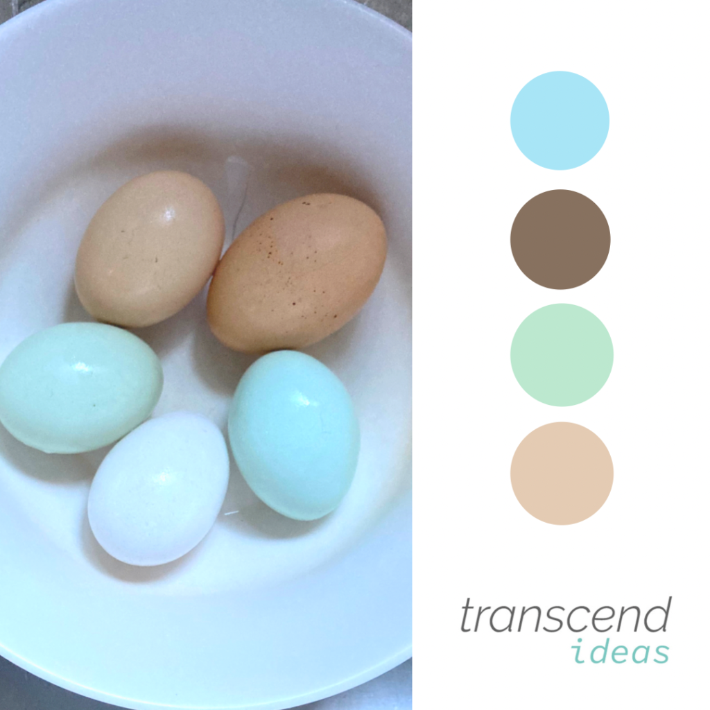
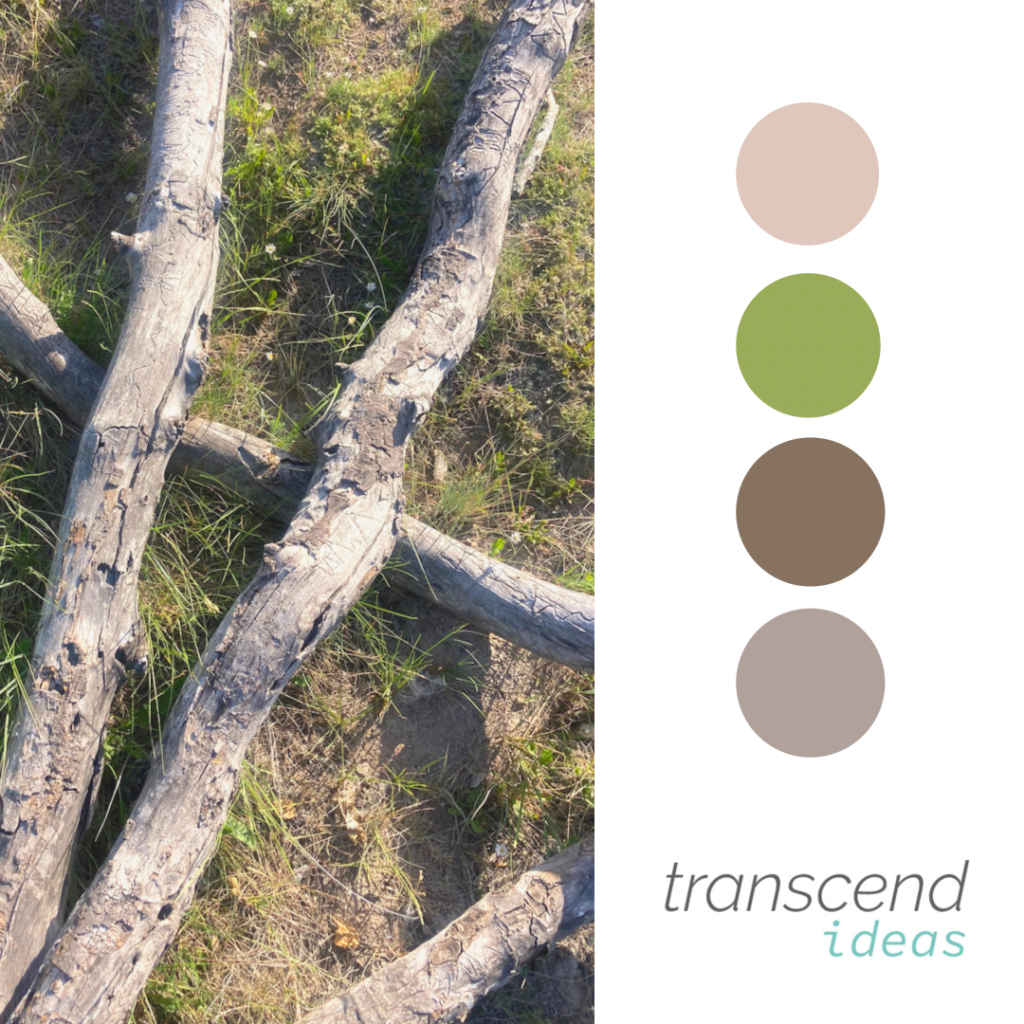
A large component of brand identity and discovery is choosing the color palette. Colors have meaning and some that we gravitate towards are quite a subconscious choice.
For Transcend Ideas, we utilized;
Beige: unification
Brown: stability
Blue-green: calm, service
If you ask us, that is pretty spot-on.
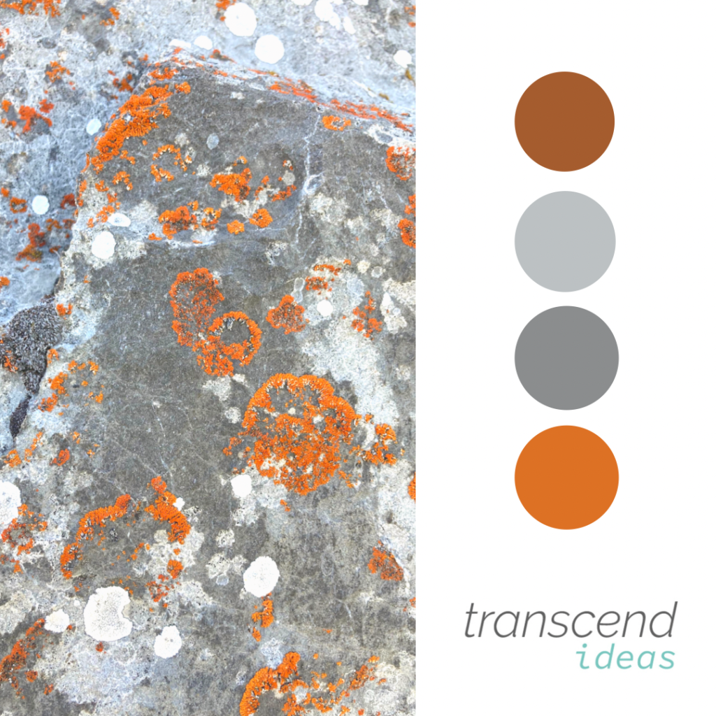
We found some beautiful hues in nature that also tell a story of the energetic embodiment different color palettes can provide.
When we begin working with a client on brand identity we first enter into discovery, read more here. After discovery, you enter into the logo variations. We urge our clients not to enter colors just yet because it could influence the choice of the logo itself. You may have heard the term “make it pop” and it’s quite literally what varying colors do, bring life and richness to the brand. Palettes can have their own emotional response they elicit, blues represent trust whereas red can represent excitement or anger. Color evokes an emotional response and can often influence a subtle change in your feelings and perceptions toward a company, from merely a logo or brand campaign alone.
Discovery is simply that, discovering what your brand could become.
A vital component of this exercise is to uncover the personality of the brand. Would you like their personality if the brand were a person? Could you be friends? Does your first impression make you want to do business with them? Why?
Starting with a list of traits and action words helps narrow the scope to make you think a bit before diving into the name and the logo mark. Use this opportunity to brain dump all of what you hope for your brand, including: phrasing associated with niche populations you’d like to reach, values, long-term goals, and aspirations for your business as you are starting to identify words and phrases you’d like to align with.
Building Identity for Transcend Ideas
For Transcend Ideas we went through a discovery as well and we certainly did not take it lightly. We brainstormed on words that conveyed growth and progression. We thought of words that went beyond ascension.
Our words:
trustworthy
curiosity
nature
friendly, approachable
compassionate
inclusive
playful
simple, yet interesting
thoughtful
inspiring
Contact us for Business Discovery
Hopefully this approach will give you some ideas on how you’d like to approach your brand identity journey. Read more about what your discovery entails and email hello@transcendideas.com for any questions on how we can help. Want to get started on your business discovery? Fill out our client questionnaire at this link to get started!
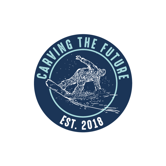
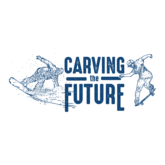
Carving the Future is a non-profit that’s mission is to empower youth through snowboarding and skateboarding. They were looking for a brand identity package to convey “cool” and “confident”. The logo variations include designs that can be applied to hoodies, stickers, and banners.
The snowboarder and skateboarder were both previously illustrated by Amy Dowell, a local artist. Amy vectorized the icons to utilize in the logo variations for Carving the Future.
The use of turquoise blue and deep navy blue lend to the identity package goals of a “cool” vibe for youth interested in snowboarding and skateboarding. The cool colors, also, coincide with winter sports and associated apparel/accessories.
Designed with Gliffen Designs
Contact Transcend Ideas today to discuss how we can make your creative vision come to life. Whether it be sports, wilderness protection, or personal passion projects – Transcend Ideas is here to serve you.Tell us a little more about yourself and your business at this link.
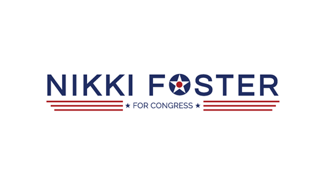
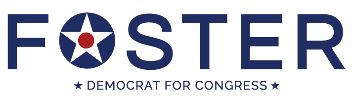
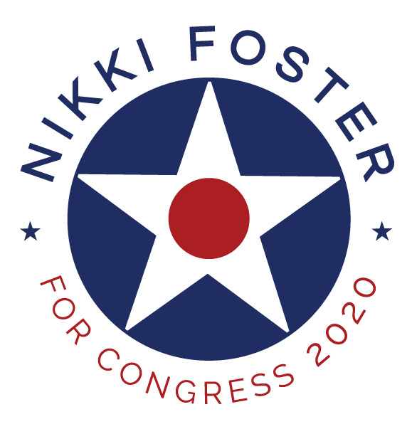
Nikki Foster ran for Congress in Ohio District 1 in 2020 and needed a branding identity for her campaign. Her long career in the Air Force as a pilot helped inspire the creative direction of her campaign brand.
The color blue was the main color because she was running on a Democratic ticket coupled with red accents. The stacked icons of the red circle inlaid in a white triangle brought a patriotic feel to the design. All of these icons residing within the blue ‘O’ shape make for a clean first impression.
Both a primarily text-based logo design and a logo design that was centered in a circle shape were used for this campaign. Nikki and her campaign team needed these logos to put on all materials for fundraising and public speaking events around District 1 in Ohio, where she was running for a Congressional seat.
We would vote for Nikki Foster for Congress any day!
Do you know someone running for office, whether that be at their local precinct or the state level? We would love to help and support your campaign team’s efforts for you to win a seat in the area of your choosing. We believe in advocating for the people you love and the principles you believe in. Let’s get coffee to chat about your campaign goals!
The Wyoming Coalition for Animal Protection (WYCAP) was looking for a logo design that helped represent their non-profit organization. WYCAP advocates for the species that cannot speak for themselves.
Final Concept Logo Design
Although there was debate on what species to include we did come to a compromise on which animals were represented from domestic, farm and native wildlife. The concept landed on a triangle shape to help represent the trifecta, or the categories of creatures they devote their advocacy to protect.
Color Palette
The logo uses a mid-tone blue and deep navy blue along with a golden yellow for the final concept. That lends the end user to feeling trust toward the organization. Golden yellow elicits feelings of a faithful, stable, and organized non-profit. The colors together bring in a strong combination that remains dedicated to protecting animals. The sense of calm and assurance you get from the use of colors aligns with the organization advocating for animals and others respecting rules and authority to reach their goals of preventing exploitation of all wildlife.
Designed with Gliffen Designs
Contact Transcend Ideas for your logo concept design needs today. Visit this link to set up a time to chat about your business needs. We’d love to work with you.
Jackson Hole DEI Collective came to Transcend Ideas for help on a logo concept that would help represent them. DEI stands for Diversity Equity and Inclusion and with those three letters there is a lot of meaning packed in there. The logo mark was inspired as one continuous simple symbol that represented the core principles of the Collective.
Action words:
compassionate
strong
inclusive
PURPOSE STATEMENT: The Jackson Hole DEI Collective is a group of local leaders working together to make our community more equitable, inclusive, and racially just. Members of the Collective occupy intersecting dominant and marginalized identities, including black people, people of color, and white people. We are straight and LGBTQ+. We are cis-gendered and genderqueer.
Colors: Grey & Forest Green
Contact Transcend Ideas for help in creating a logo concept that works for the needs and values of your business. Describe your goals with Transcend Ideas at this questionnaire link.
Nom Nom Doughnuts company was looking for a hand-drawn logo to convey their mobile doughnut business. This little airstream makes donuts that are delightfully light with big flavor.
The company needed a light-hearted and airy design that would be eye-catching for the general bystander at concerts and events in Jackson and around western Wyoming.
Nom Nom Doughnuts Final Logo
Heather brought her illustrative expertise to this project. The hand-drawn effect of an airstream shows doughnuts of varying textures coming across the top of the vehicle in an arc effect. The use of color on this project was playful and vintage, lending to the vintage effect of the airstream trailer that they have revamped into a delicacy-baking food truck machine. The logo created represents the wide variety of doughnuts that could be purchased from their company. The airstream identity on the branding fits right in with the exploratory and laid-back vibe that many in the town of Jackson resonate with.
Location
You can find Nom Nom Doughnuts at concerts, community events, and all around the town of Jackson. Make sure to stop in and say hello to the team!
Designed with Gliffen Designs
Are you looking to hire illustration work for your business? Contact Transcend Ideas to discuss what you are needing for your business!
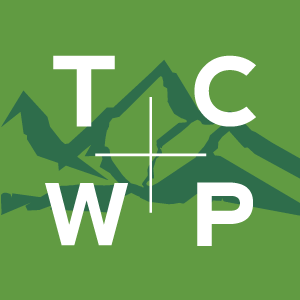
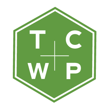
Teton County Weed and Pest is a local government agency that’s mission is to protect, manage and restore ecosystem integrity through comprehensive invasive species management for the benefit of ecological and human health. They were looking for a brand identity package to convey their commitment to the community with a bold more modern look than their previous logo variation.
The simple shape of the mountains gives homage to the Tetons and the more geometric and modern fonts allow for a much more approachable design. Teton County Weed and Pest utilizes these new logo variations on all their published products, website, and social media campaigns. This helps TCWP to build brand familiarity and trust with customers.
Designed with Gliffen Designs. Are you interested in collaborating with Transcend Ideas on a new brand and identity package for your business? Contact us today!