Make Your Content Stand Out in 2024

Make Your Content Stand Out in 2024

The internet evolves at lightning speed. ⚡️

Trends from a decade ago are long forgotten, and even last year’s sensations have faded. With countless accounts competing for attention across numerous platforms, standing out in this saturated digital landscape demands a more strategic approach than ever before.

When looking at social media forecasts and predicted trends, it’s important to remember that anticipating future trends is always a challenge. For example, today I created a meme for a client based on Olympic pommel horse specialist Stephen Nedoroscik’s bronze medal-winning routine—a twist I never would have predicted last week.

However, we can do our best to observe where momentum is shifting. Staying ahead of trends and paying close attention to emerging patterns is crucial for success in content marketing. Effective content serves as a powerful tool for small businesses to build brand awareness, engage with customers, and drive sales. So, what might be in store for 2024?

A Few Ways to Make Your Content Stand Out in 2024:

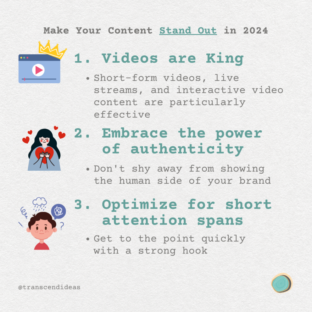
Make your content stand out in 2024: 1. Videos are King 2. Embrace the Power of Authenticity 3. Optimize for short attention spans

1. Videos are King

 In the visual-centric world of social media, video content continues to reign supreme. Short-form videos, live streams, and interactive videos are all particularly effective at capturing audience attention.

Video content creation

2. Embrace the Power of Authenticity 

Audiences in 2024 crave genuine content that feels real and relatable. Don’t shy away from showing the human side of your brand. Share behind-the-scenes glimpses, customer success stories, or even the occasional blooper to build trust and foster deeper connections.

3. Optimize for Short Attention Spans

 With the rise of platforms like TikTok and Instagram Reels, short-form content is more popular than ever. Get to the point quickly with a strong hook, break complex ideas into bite-sized chunks, and use visually appealing graphics. Apply this to written content too by breaking up blogs and newsletters into lists and highlighting key points.

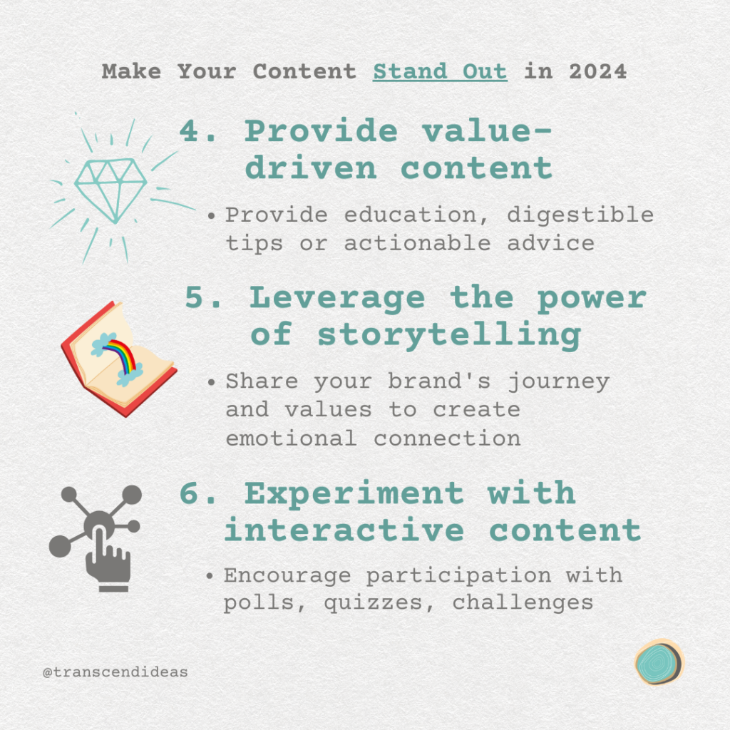
Make Your Content Stand out in 2024: 4. Provide value-driven content 5. Leverage the power of storytelling 6. Experiment with interactive content

4. Provide Value-Driven Content

Your audience is looking for solutions to their problems. Focus on a strategy that educates your audience on industry-related topics, offers practical tips and actionable advice, and addresses common customer pain points.

5. Leverage the Power of Storytelling

 Humans are wired to respond to stories. Use narrative techniques to share your brand’s journey and values, highlight customer experiences and testimonials, and create emotional connections with your audience.

6. Experiment with Interactive Content 

Engage your audience by encouraging participation. Try incorporating polls, quizzes, user-generated content challenges, and live Q&A sessions or AMAs (Ask Me Anything) to boost engagement.

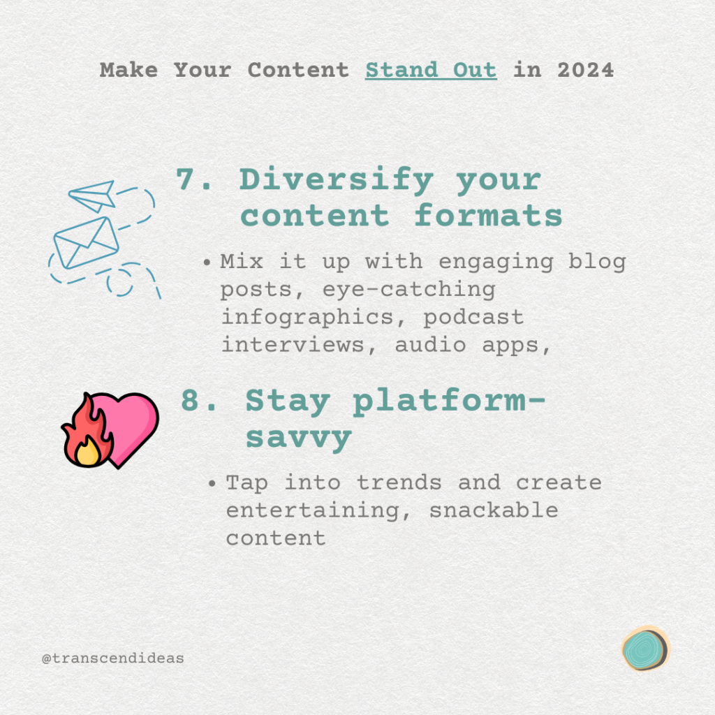
7. Diversify your content formats 8. Stay platform-savvy.

7. Diversify Your Content Formats 

While video may reign supreme, don’t put all your eggs in one basket. Mix it up with engaging blog posts, eye-catching infographics, podcast episodes, and interactive webinars or workshops.

8. Stay Platform-Savvy

Each social media platform has its own quirks and best practices. For Instagram, focus on creating visually stunning Reels and Stories. On LinkedIn, share industry insights and thought leadership content. For TikTok, tap into trends and create entertaining, snackable content.

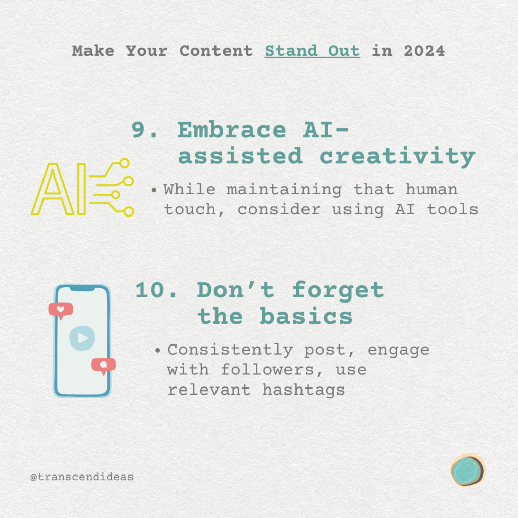
9. Embrace AI-Assisted creativity 10. Don't forget the basics

9. Embrace AI-Assisted Creativity 

While maintaining that human touch, consider using AI tools to generate ideas, optimize your posting schedule, and analyze performance data to refine your strategy.

10. Don’t Forget the Basics

 In the rush to stay trendy, remember these timeless principles: consistently post high-quality content, engage with your audience through comments and messages, and use relevant hashtags to increase discoverability.

Remember, the key to standing out in 2024 isn’t just about following trends—it’s about understanding your unique audience and delivering content that resonates with them. Keep experimenting, analyzing your results, and refining your approach. With persistence and creativity, your content will shine bright in the crowded digital landscape.

At Transcend Ideas, we’re passionate about helping brands create messaging that truly connects. Whether you’re looking to revamp your content strategy or need a fresh perspective on your brand’s voice, we’re here to help you transcend the ordinary and make your mark in 2024 and beyond.

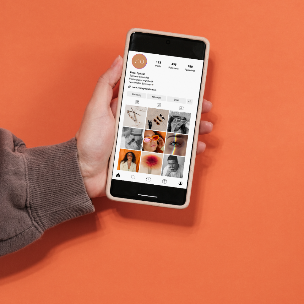
Photo of hand holding smart phone with instagram profile over an orange background

Ready to elevate your content game? Let’s chat about how we can bring your brand’s unique story to life!

If These Fonts Could Talk

Fonts tell us a lot about a brand, and there is much to discuss about them. We like to think that fonts have their own personalities, and they make a big difference in how consumers communicate with a brand. We could go on for a while, but we’ll try not to get too nerdy. We’re font fanatics here at Transcend Ideas. 

Typography vs Fonts

Let’s start by clarifying the difference between typography and fonts. Typography is the art of arranging type to facilitate effective communication. While typography encompasses everything related to text, we are focusing on fonts in this discussion.

Font Vocabulary

To discuss fonts, it’s helpful to understand some of the important terminology you might hear surrounding fonts.

Typefaces: The visual designs that give characters their distinct style.

Fonts: The digital files that allow typefaces to be displayed on screens and in print. (Typefaces are what you see and fonts are what you use) 

Weight: Refers to the overall thickness of the strokes in a typeface within a specific font. (ie. bold or regular)

Style: Regular, italic, oblique, and small caps are all examples of styles that can exist within a single typeface.

Font Family: If we consider a typeface to be the core design, then the different weights and styles could be said to be instances of that design, and together they form a family (or type family, or font family).

Definitions source via Google fonts. Learn more typography-related terms here.

Serifs vs Sans Serif

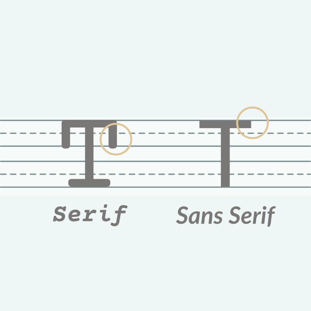
A serif is a small line or stroke regularly attached to the end of a larger stroke in a letter or symbol. Fonts are either serif fonts or sans serif fonts, with “sans” meaning “without” these strokes. For example, Times New Roman is a serif font, and Arial is a sans serif font. This text in particular is a sans serif font. 

Typically, serif fonts make for an easier reading experience and work well in body text, especially at smaller sizes. Sans serif fonts tend to work well on signage where there is minimal text. However, there are exceptions, and serif and sans serif fonts can be paired within the same document to create a harmonious look.

Primary & Secondary Fonts

When selecting fonts for your brand, you should choose a primary typeface that reflects your overall brand identity. You should also select a secondary font that complements the primary font and helps create supportive documents. Sometimes, contrast is effective with a thicker primary font and a thinner secondary font or a serif paired with a sans serif. Other times, more subtle differences between the primary and secondary fonts can work well.

The Use of the Font

Consider the purpose of the font when choosing one. Is it for a logo, a newsletter, a graphic, or a flyer? Font use will vary depending on the content you are creating. For example, the controversial font Comic Sans tends to work well within a classroom setting, but using it for a funeral program would be deemed inappropriate.

Tone of the Font

The choice of font can come down to the tone you want to convey. How do you want to present your brand to your audience? A lot depends on the taste of the organization itself. For example, a bank will likely have different fonts than a flower shop. Is it important for your brand to be approachable? Formal and informative? Quirky and cool? 

Accessibility

Another important aspect of fonts and typography is considering accessibility. Some fonts can be more difficult to read for individuals with intellectual differences and physical disabilities. Clarity, size, and contrast are crucial details to consider. In general, you want your fonts to be easy to read both up close and from a distance. Learn more about accessible design here. When we design inclusively, we widen our audience and extend the reach of potential customers.

Choosing the Right Font for Your Brand

an unfortunate font choice

Fonts significantly influence how customers and viewers perceive your brand. A poor font choice can lead to embarrassing consequences. Many problematic fonts are overused—looking at you, Papyrus. With a bit of knowledge and careful observation, you can avoid these mistakes. A carefully selected font can make an immeasurable impact on your brand’s perception. Finding the right font takes time, knowledge, and experience. Often, it also requires some typography work from a graphic designer to make it truly shine.

Feeling Overwhelmed?

We get it, there’s an overload of information out there on fonts and so many to choose from. Take a deep breath and reach out to us to help with your design. There is a difference between a designer’s perspective and a client’s perspective. With clear communication between the two, the perfect font is out there waiting to be put to use.

Why Your Brand Needs a ‘Brand Book’

Transcend Ideas - Brand Book

In today’s competitive business landscape, establishing a strong and consistent brand identity is crucial for success. One effective tool that can help you achieve this is a ‘Brand Book.’ If you’re unfamiliar with this concept, don’t worry – you’re not alone. Many brands and businesses have yet to create one. However, investing time and effort into developing a Brand Book can save you valuable resources in the long run and significantly boost your organizational efficiency.

As we enter 2024, it’s the perfect time to prioritize organization and streamline your brand.

What is a Brand Book?

Brand book - photo stock

A Brand Book is a document or file that concisely captures and visually presents the key characteristics of your brand. It serves as a centralized resource containing essential elements such as logos, alternative logo versions, brand icons, fonts, color palettes, taglines, and other distinctive traits specific to your brand. These resources are valuable references when creating various materials for your business, acting as a personal recipe book for maintaining brand consistency.

Why Does Your Business Need to Define Brand Guidelines?

Brand consistency is key to building a strong and recognizable brand. A Brand Book plays a vital role in achieving this.

By having one, you can ensure that all branded materials created throughout your business’s lifespan adhere to a consistent visual and tonal identity. It also facilitates collaboration with external partners, such as graphic designers and writers, by providing them with a clear framework to work from. This not only saves time but can also reduce costs. Additionally, having all the components of your brand compiled in one place fosters a shared understanding of your brand’s essence among everyone involved.

How to Make a Brand Book

If you have a professional designer working on your logo and branding, you can request a Brand Book as part of their deliverables. However, if you haven’t done so, don’t worry. Creating your own is entirely feasible, regardless of your brand’s stage of development.

The preferred format for a Brand Book is a portfolio-style packaged PDF. The length will depend on the unique characteristics of your brand. It could be as concise as a single page or extend to dozens of pages. Consider including the following brand information:

  • Cover
  • Table of Contents (for larger organizations)
  • Brand History
  • Who we are
  • What we do
  • Mission
  • Values
  • Logo and its different variations (refer to this helpful resource for guidance on what to include in your logo package)
  • Icon
  • Color palette (include swatches of each brand color along with their RGB and Hex codes)
  • Typography (primary and secondary fonts, including style variations like bold and italic)
  • Photos that encapsulate your brand (could be presented in a mood board)
  • Voice (tone of voice for written deliverables concerning your brand)
  • Taglines
  • Website (including address)
  • Social media handles, platforms used, and potentially some information on your brand’s social media strategy

By investing time and effort into creating a comprehensive Brand Book, you’ll be equipping your business with a powerful tool for maintaining brand consistency and ensuring a strong and recognizable brand presence in the market.


Looking for support as you pull in items for brand identity? Reach out to our team for support today in creating a brand book!

JH Nordic Annual Event 2024 Case Study

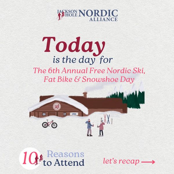
Transcend Ideas is proud to continue our partnership with JH Nordic. We are proud to support their mission to improve winter trails access, education, and stewardship in the Teton. The Jackson Hole Nordic Alliance Annual Free Ski, Snowshoe, and Fat Bike Day event has become a favorite tradition for families and the community to come together to celebrate winter recreation in the Tetons. We are proud to have provided the illustration and marketing for the 2024 event this year.


JH Nordic Annual Free Ski, Snowshoe, Fatbike Day at Turpin Meadow Ranch

Transcend Ideas was proud to support the goal to provide education and increase awareness and community around winter trails use in the Tetons for visitors and locals alike.

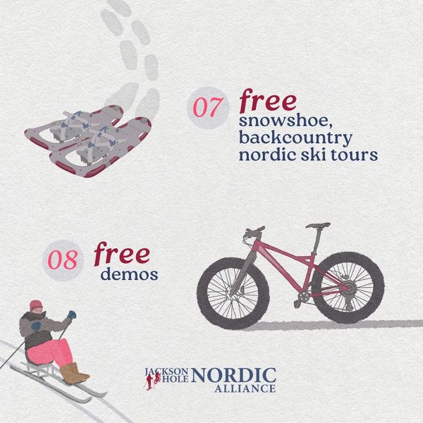
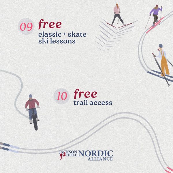
  • Our team generated an illustrated vintage-style poster reminiscent of skiing and days spent on winter trails from the past. This appeals emotionally to viewers of both the physical and digital marketing campaigns.
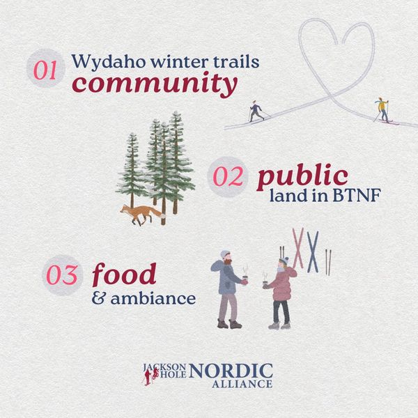
  • Digital graphics were created for social media as a 10 day countdown to increase excitement and engagement online. A consistent digital presence promoting attendance at the 6th Annual Free Ski, Snowshoe, and Fatbike Day supported the success of the event.

Visit the JH Nordic website to learn more about all things winter trails and grooming in the Tetons.


Learn more about how Transcend Ideas can help with strategy and marketing behind your non-profits next big community event!

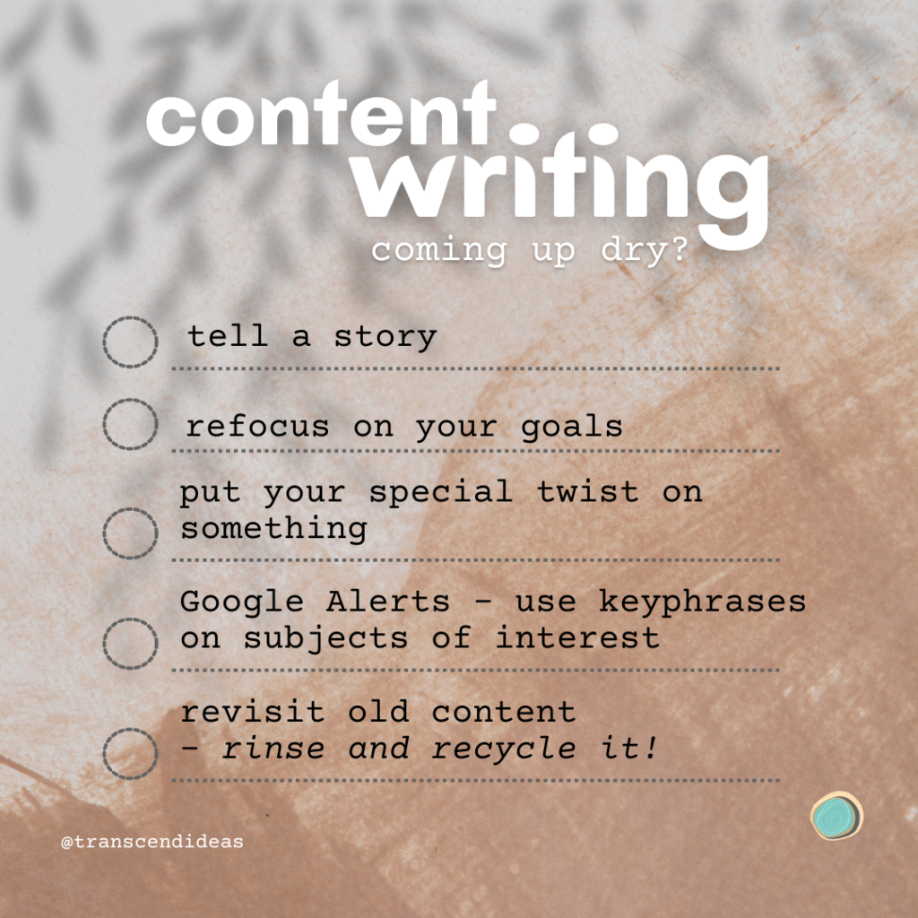
Coming up Dry with Content Writing?

Are you having a dry spell?

It happens. Where trying to come up with new content can take time and effort. Are you coming up dry with content writing? Here are some excellent ways to help ignite inspiration in writing content for your business:

  • Tell a story out of the personal experience
  • Refocus on your goals – ask yourself what’s important to share to stay in alignment with your messaging
  • Utilize a subject you came across in your news feed and put your unique twist on it
  • Create Google Alerts – you’ll receive an email any time that particular keyword or keyphrase comes across the headlines (blog, articles, videos)
  • Revisit old content – rinse and recycle it like it’s new again!
  • Stay inspired – read a book, have a conversation, listen to a podcast, and let it sink in and inspire you!
List for content ideas from Transcend ideas. "Coming up dry with content writing? Tell a story, refocus on your goals, put your special twist on something, Google Alerts - use keyphrases on subjects of interest, revisit old content - rinse and recycle it."

Even this blog post helped me reignite some ideas for blog posts and social media posts in 2023! Jot down your content ideas and spread them out over time. Set a goal to share content with your audience, in order to keep engagement alive. They want to hear from you and what you have to share. Here are some ways to keep your content marketing flowing smoothly:

 Formula to Follow for Content Marketing

  1. Outline the subject matter with lists; everyone loves a good digestible list!
  2. Reference videos or audio to help your reader tie it all together (short form video “reel” or TikTok to touch on your key points)
  3. Short form writing (5-7 mins read), people are busy..
  4. Supportive graphics adapted for social media with Canva
  5. Use Grammarly to proofread your writing (God knows I need it)
  6. Reinforce your images with Alternative text to ensure your content is more accessible and strong captions for your posts but not too long, keep it short and sweet with CTA to read more and sign-up
  7. A clear CTA (call-to-action) at the end of the writing with what to do with this information they just read
  8. Automate your social media posts and reference to the content
  9. Use relevant hashtags but don’t overload on them
  10. Don’t shy away from 🔥emojis, if I’m writing on my desktop I utilize emojipedia.org

Get inspired: Inspiring podcast episode from NPR Life Kit that might help ignite some curiosity in your personal branding.

We all have times when we feel we are coming up dry with content writing. Get back into creating with some curiosity, have some fun, and speak authentically.

Stay tuned for more content that may help with your messaging.

Topics we cover: Marketing | Branding | Case Studies | People

Do you have a Purpose-Driven Brand?

I love this question because every business you see has a purpose that drives it forward. If that “WHY” isn’t asked regularly, the why may get lost in the hustle. Ask yourself:

“Do you have a Purpose-Driven Brand?”

If the answer doesn’t come right away, that’s okay. But keep in mind that when you can answer it immediately, you have a direct purpose in how you show up for your community. If you can’t answer that fundamental question, it may be best to take a beat and dig deeper.

You ought to audit your own business, so you don’t mission creep or grind without that purposeful “why” at the core of your offering. When we begin taking on aspects of our business that don’t align with our purpose we lose sight of that “why.” Maybe your why will shift and mature, and that’s also okay.

Here are some branching off purpose-driven questions to consider thinking about:

  • Who do you serve?
  • Why do you serve them?
  • What drives you to serve them?
  • What motivates you to continue serving them and others like them?
  • Are you asking your audience what they want and need so you can improve your work?
  • Do you feel fulfilled in helping your audience achieve in their business?
  • If not, why? And how can you shift that attitude?
  • Are you excited about the work you do and the serve you provide others?
  • Are you continually learning about your industry? Are you keeping that door open? Or have you closed that door to continual personal/professional growth?

Transcend Ideas – People Centered

Our brand, Transcend Ideas, in my mind, is purpose-driven because we serve small businesses and non-profits to amplify their meaningful message through branding and marketing strategy. What amplifying means to me is to tell their story. People’s stories are interesting. I began this company because I care about people and the communities they serve. I will continue to ask myself that significant “WHY” so I don’t lose sight as we learn and grow as a company.

The purpose of human life is to serve, and to show compassion and the will to help others.

Albert Schweitzer

Patagonia – Planet Earth Centered

Patagonia is a company that I had respected for a long time, even before their CEO, Yvon Chouinard recently announced a shift with Patagonia and their efforts to combat the climate crisis in a huge way. More explanation here. Patagonia has stood for sustainability since the company’s inception 50 years ago. They hooked me in when I realized they’d repair your gear if you mail them in, and if they can’t improve them, they will replace it with brand-new Patagonia gear all together.

Earth is now our only shareholder.

If we have any hope of a thriving planet—much less a business—it is going to take all of us doing what we can with the resources we have. This is what we can do.

-Yvon Chouinard

Clubhouse Conversation:

Come join the conversation on Clubhouse, if you don’t have the App downloaded you can still listen to the conversation in your browser. You can listen back to this conversation if you missed it all together. I love to engage in conversation with people all over the country and the world as that’s when the richest conversations happen.

“Do you have a Purpose-Driven Brand?”

Monday, November 14th

at 11 am MST / 9 am EST

Traditional Marketing Ideas (Clubhouse/Spaces)

I was in a Clubhouse room called: “Old School Marketing” and it blew me away how important going back to basics in your marketing truly is. Check out the next set of audio rooms I will be hosting on this very topic in the coming weeks. In the meantime here are some ideas to stew on..

Traditional Marketing Ideas:

In no particular order of course, but consider these ideas to implement:

  • Word-of-mouth
  • Schedule a cup of coffee or lunch with a work colleague, even your competition to discuss business
  • Mailers
  • Handouts (flyers, rack cards, business cards)
    • Pin up in bulletin boards! – Make a list of these locales that accept those physical marketing tools
  • Stickers (clever approach – catchphrase, coolness)
  • Showing support for a charity/nonprofit organization
    • A certain % of sales goes to charity in a certain time frame
    • Sponsor an event or a sport in your town/city
  • Join the Chamber of Commerce – make connections, take advantage of ALL they offer you!
  • Contests for all ages (art, name mascot, etc.)
  • Handwritten thank you notes
  • Thank you gifts for your bigger clients
  • Exclusive sales to your most loyal customers
  • Holiday cards
  • Networking
  • In-person events – Hold in-person workshops (educate, inform, engage – build trust)
  • Community calendars for events you are hosting
  • Print ads in local newspapers
  • In-store signs (sandwich boards)
  • Takeaways: Bumper stickers, stickers, branded water bottles
  • Name tags – custom name tags, wear your logo and name (perhaps pronouns too) to remind people what you are about!
  • Movie theatre ads – Slides or videos of local businesses
  • Post-it notes – custom couple with your business card (good leave behinds)

“Create social proof through that localize medium!”

Heather Cox
traditional marketing ideas

“Tried and True” Marketing Ideas

Going back to the “tried and true” methods of marketing can be just what you needed to revitalize your connection with your audience. I am all for digital marketing, it’s predominately what I do but there is something to be said for that personal touch to make a connection. When we build relationships we are developing trust and communicating and we can’t always lean into digital technology to do that.

These marketing ideas are meant to be approached “in tandem” with digital marketing! Don’t discount the basics and ask yourself what you can you use in Q4 and what could you utilize in your marketing strategy for 2023.

Join the Traditional Marketing Ideas Conversation

Join Heather for a Clubhouse Room AND Twitter Spaces on “Old School Marketing Ideas.” All conversations will be recorded so you can listen in at a later time to learn a bit here and there. We will not be focusing on digitally marketing.

Clubhouse
“Old Skool Marketing for Biz and Nonprofits”
Wed, Oct 19th at 11:15 am MDT

Twitter Spaces
“Old Skool Marketing”
Wed, Nov 2 at 11:30 am MDT


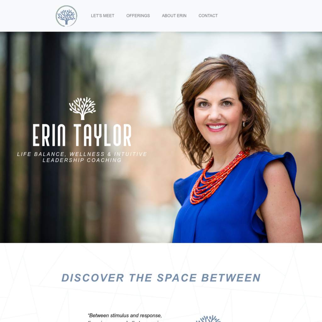
Case Study: Erin Taylor Coaching

Erin Taylor came to Transcend Ideas for a website to help market her wellness and intuitive leadership coaching practice. It was a pleasure to help Erin find her voice, her focus, and lead the approach of her site design.


“Between stimulus and response, there is a space. In that space is our power to choose our response. In our response lies our growth and our freedom.”

— Victor Frankl

Erin Taylor Coaching offerings are:

Life balance, mindfulness in the workplace, wellbeing, and intuitive leadership. She offers keystone speaking, individual coaching, and group training. Erin loves to reference Victor Frankl in how she shows up in her coaching, helping her clients discover the space between.

Often it’s the simple things that make a big difference:

  • Icon sets can help break up content and help the visitor organize content
  • Utilize bullet points so it’s easier for them to scan your content
  • Using subtle geometric parallax backgrounds, it helps break up the sterile white background
  • Seeing her face in her portrait(s) throughout the site is important for her potential clients to see who they will be working with
  • Humanize herself by sharing more about her journey and her “why”

The clarity, the simplicity, and relatability of Erin will help rope in clients into her coaching practice.

Learn more about how Transcend Ideas can help your vision for your business come to life.

Erin Taylor Coaching logo
LIFE BALANCE, WELLNESS & INTUITIVE LEADERSHIP COACHING