JH Nordic Annual Event 2024 Case Study

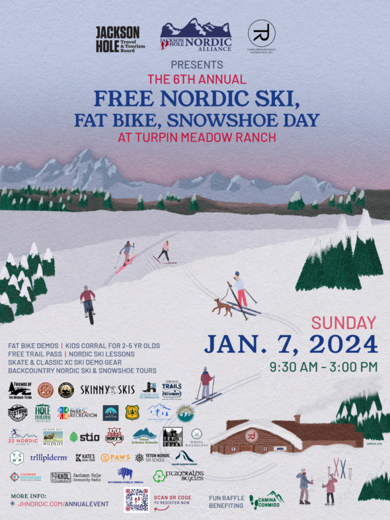
Transcend Ideas is proud to continue our partnership with JH Nordic. We are proud to support their mission to improve winter trails access, education, and stewardship in the Teton. The Jackson Hole Nordic Alliance Annual Free Ski, Snowshoe, and Fat Bike Day event has become a favorite tradition for families and the community to come together to celebrate winter recreation in the Tetons. We are proud to have provided the illustration and marketing for the 2024 event this year.
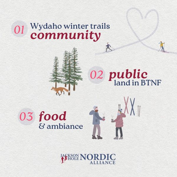
JH Nordic Annual Free Ski, Snowshoe, Fatbike Day at Turpin Meadow Ranch

Transcend Ideas was proud to support the goal to provide education and increase awareness and community around winter trails use in the Tetons for visitors and locals alike.

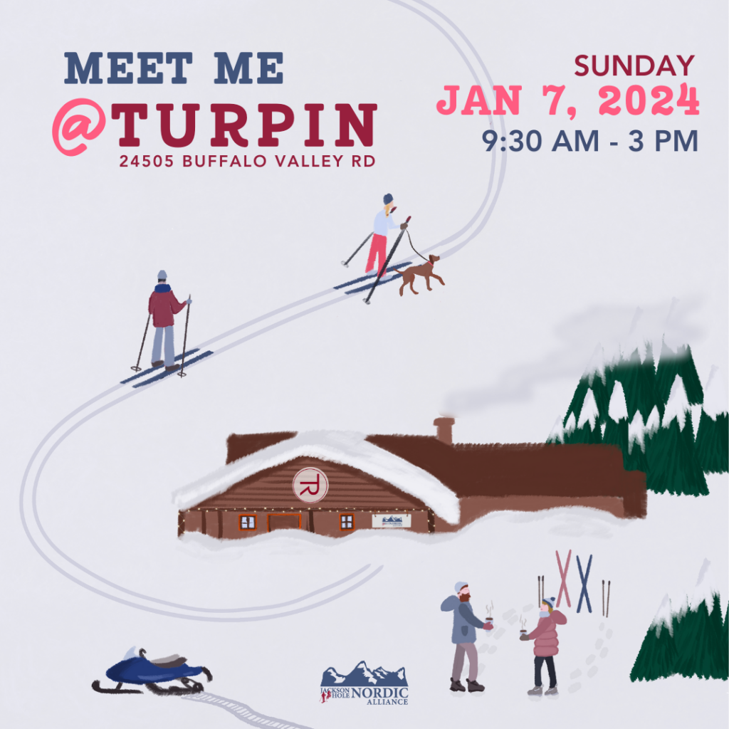
  • Our team generated an illustrated vintage-style poster reminiscent of skiing and days spent on winter trails from the past. This appeals emotionally to viewers of both the physical and digital marketing campaigns.
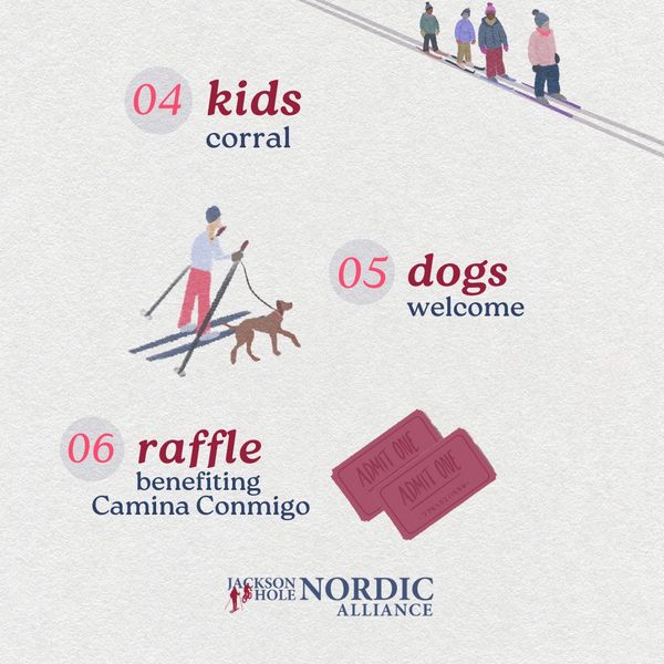
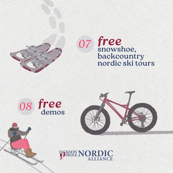
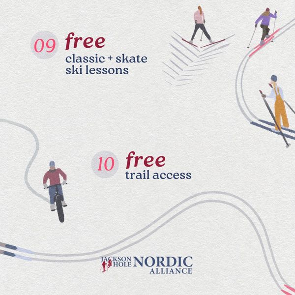
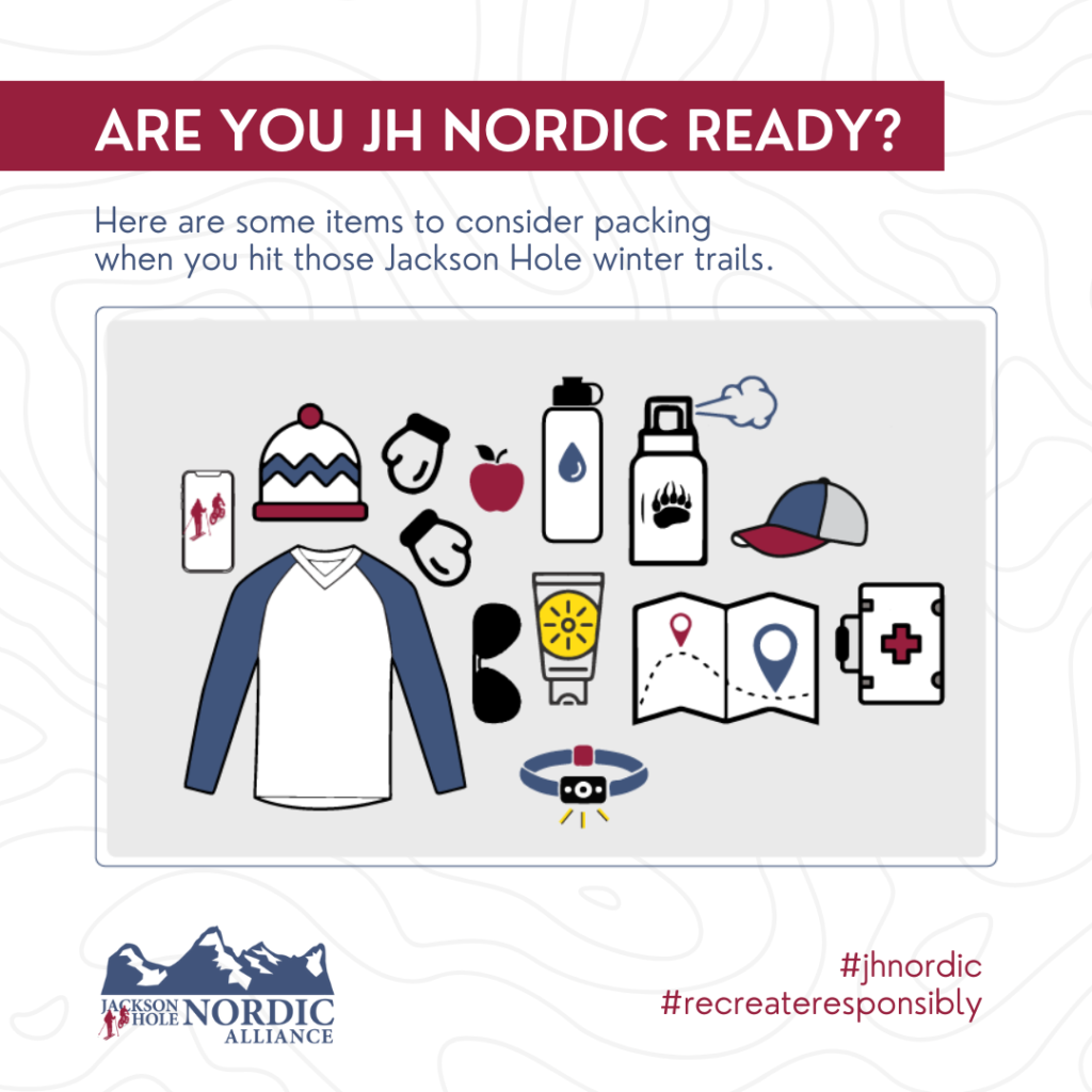
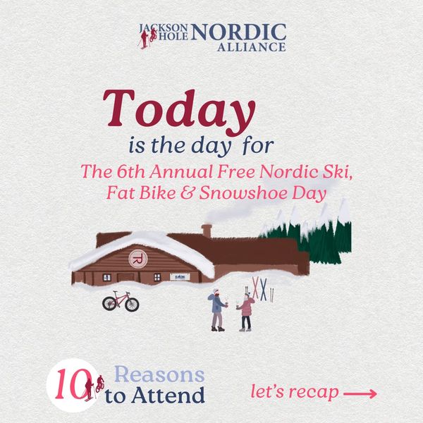
  • Digital graphics were created for social media as a 10 day countdown to increase excitement and engagement online. A consistent digital presence promoting attendance at the 6th Annual Free Ski, Snowshoe, and Fatbike Day supported the success of the event.

Visit the JH Nordic website to learn more about all things winter trails and grooming in the Tetons.


Learn more about how Transcend Ideas can help with strategy and marketing behind your non-profits next big community event!

Dear Canva, I LOVE you!

A quick geek out over Canva!

This is a geek out blog post about Canva. If you haven’t guessed, I love the platform and what they provide businesses. Their platform continues to amaze me and what you can do with it. How may I count the ways.. I love you, Canva!

SVG Magic in Branding Your Business

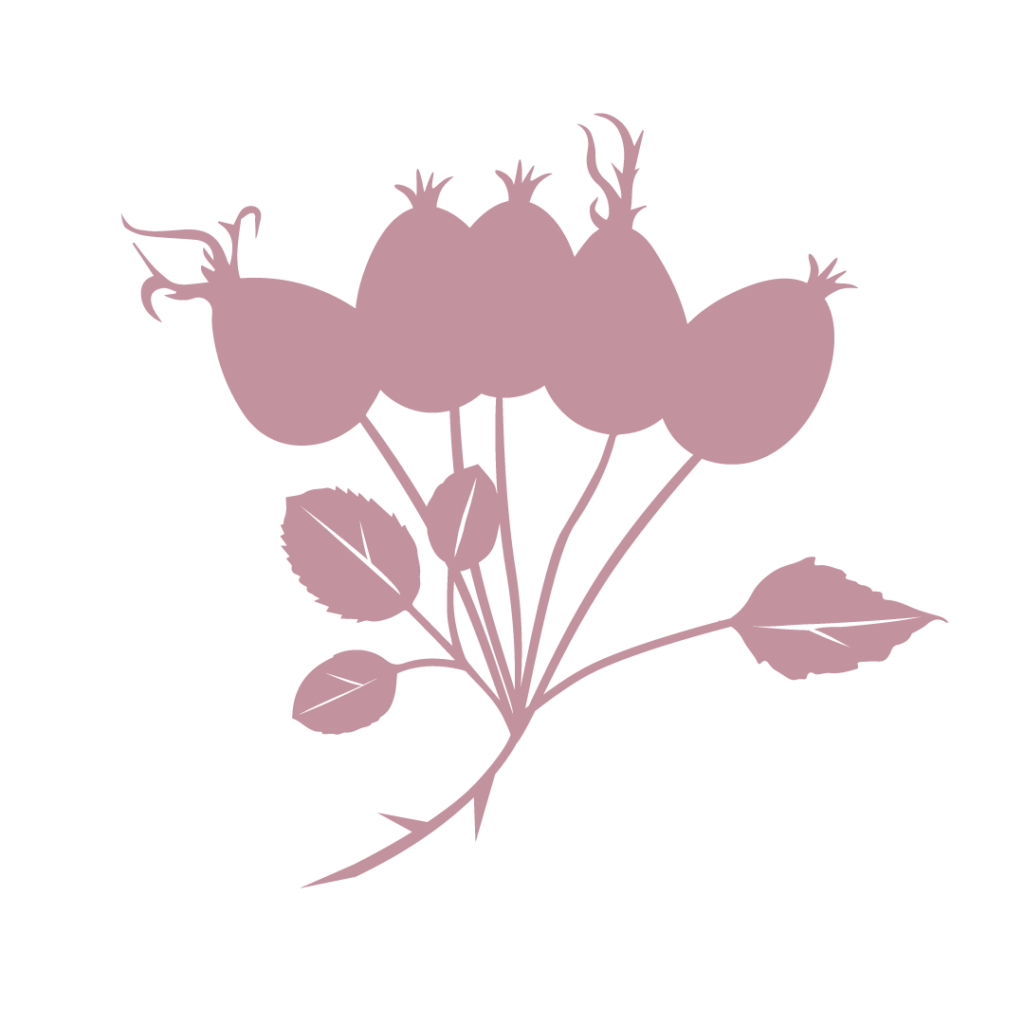
DeLacy Tea Company – SVG rosehips

Let’s begin with SVGs, which stands for: Scalable Vector Graphics.
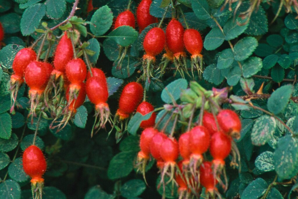
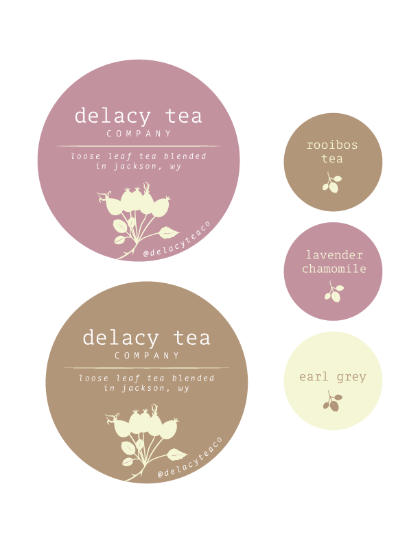
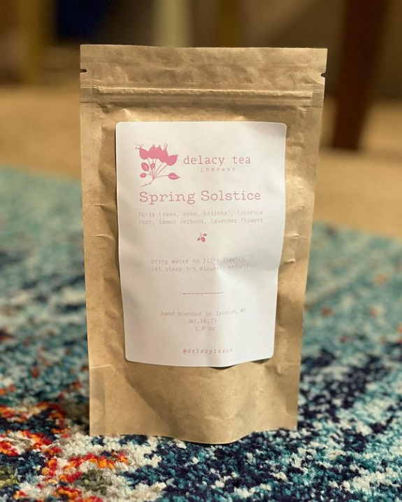
This handy-dandy format allows for your vector files to be colorized before your eyes. That’s right. Exactly how you can pull an element from Canva and change out a color to your liking? I recently designed something for Mariel’s DeLacy Tea Company. Delacy Tea Company wanted to utilize the rosehips element on different tea labels. Each label needing to be a different color, so making a couple of elements she can then colorize in Canva was huge! An important tip for Illustrator/vector designers: make sure the vector is completely closed so the element can be colorized effectively in Canva. For this sample of their rosehips (right), I had the lines in the leaves transparent and not white so that the rosy color or any color of their choosing can stand out on a contrasting background.

There are some smaller businesses that need to be able to “play” with their logo and with this versatility it allows for a business owner to take it upon themselves to make necessary changes on their own.

From now on, when I package my client’s graphics and hand them over, SVGs will be on that checklist of elements that are an absolute must. Exporting elements for your clients that can be the most useful allows them to move freely in their brand without constraints. All too often clients have shared stories where they are left hopeless with ownership over their own logo files, domain names, hosting for their website, access to their social media platforms, etc. All forthcoming topics I will happily share in our blog.

Some Canva templates provided for marketing campaigns:

Bravo goes back to Canva, an Australia-women owned business. Canva has revolutionized graphic design for so many ambitious dreamers. Now design is accessible to anyone that wants to build a business with the help of their design platform. I couldn’t be more excited to recommend them to anyone who works in design or wants to dabble in it.

Canva Custom Template Offerings

Carving the Future | Case Study

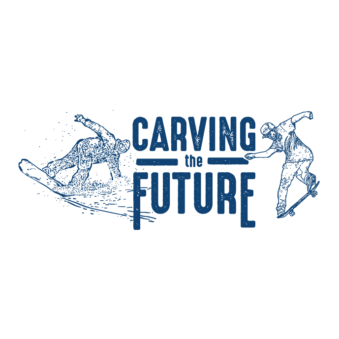
Carving the Future logo design image

Carving the Future is a non-profit that’s mission is to empower youth through snowboarding and skateboarding. They were looking for a brand identity package to convey “cool” and “confident”. The logo variations include designs that can be applied to hoodies, stickers, and banners.

The snowboarder and skateboarder were both previously illustrated by Amy Dowell, a local artist. Amy vectorized the icons to utilize in the logo variations for Carving the Future.

The use of turquoise blue and deep navy blue lend to the identity package goals of a “cool” vibe for youth interested in snowboarding and skateboarding. The cool colors, also, coincide with winter sports and associated apparel/accessories.

Carving the Future acronym CTF logo design
Carving the Future Est. 2018 round icon logo design
Carving the Future logo design with snowboarder and skateboarder on design

Designed with Gliffen Designs


Contact Transcend Ideas today to discuss how we can make your creative vision come to life. Whether it be sports, wilderness protection, or personal passion projects – Transcend Ideas is here to serve you. Tell us a little more about yourself and your business at this link.

Case Study: Wyoming Coalition for Animal Protection

Wyoming Coalition for Animal Protection - Wycap logo image

The Wyoming Coalition for Animal Protection (WYCAP) was looking for a logo design that helped represent their non-profit organization. WYCAP advocates for the species that cannot speak for themselves.

Final Concept Logo Design

Although there was debate on what species to include we did come to a compromise on which animals were represented from domestic, farm and native wildlife. The concept landed on a triangle shape to help represent the trifecta, or the categories of creatures they devote their advocacy to protect.

Color Palette

The logo uses a mid-tone blue and deep navy blue along with a golden yellow for the final concept. That lends the end user to feeling trust toward the organization. Golden yellow elicits feelings of a faithful, stable, and organized non-profit. The colors together bring in a strong combination that remains dedicated to protecting animals. The sense of calm and assurance you get from the use of colors aligns with the organization advocating for animals and others respecting rules and authority to reach their goals of preventing exploitation of all wildlife.

Designed with Gliffen Designs


Contact Transcend Ideas for your logo concept design needs today. Visit this link to set up a time to chat about your business needs. We’d love to work with you.

Case Study: Nom Nom Doughnuts

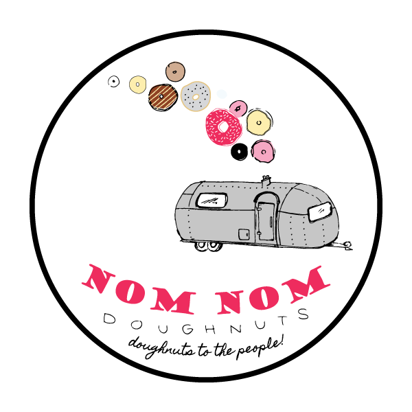
Nom Nom Doughnuts hand drawn logo

Client Request

Nom Nom Doughnuts company was looking for a hand-drawn logo to convey their mobile doughnut business. This little airstream makes donuts that are delightfully light with big flavor.

The company needed a light-hearted and airy design that would be eye-catching for the general bystander at concerts and events in Jackson and around western Wyoming.

Nom Nom Doughnuts Final Logo

Heather brought her illustrative expertise to this project. The hand-drawn effect of an airstream shows doughnuts of varying textures coming across the top of the vehicle in an arc effect. The use of color on this project was playful and vintage, lending to the vintage effect of the airstream trailer that they have revamped into a delicacy-baking food truck machine. The logo created represents the wide variety of doughnuts that could be purchased from their company. The airstream identity on the branding fits right in with the exploratory and laid-back vibe that many in the town of Jackson resonate with.

Location

You can find Nom Nom Doughnuts at concerts, community events, and all around the town of Jackson. Make sure to stop in and say hello to the team!

Designed with Gliffen Designs

Are you looking to hire illustration work for your business? Contact Transcend Ideas to discuss what you are needing for your business!

Case Study: Teton County Weed and Pest

Teton County Weed and Pest is a local government agency that’s mission is to protect, manage and restore ecosystem integrity through comprehensive invasive species management for the benefit of ecological and human health. They were looking for a brand identity package to convey their commitment to the community with a bold more modern look than their previous logo variation.

The simple shape of the mountains gives homage to the Tetons and the more geometric and modern fonts allow for a much more approachable design. Teton County Weed and Pest utilizes these new logo variations on all their published products, website, and social media campaigns. This helps TCWP to build brand familiarity and trust with customers.

Teton County Weed and Pest Logo variation

Designed with Gliffen Designs. Are you interested in collaborating with Transcend Ideas on a new brand and identity package for your business? Contact us today!