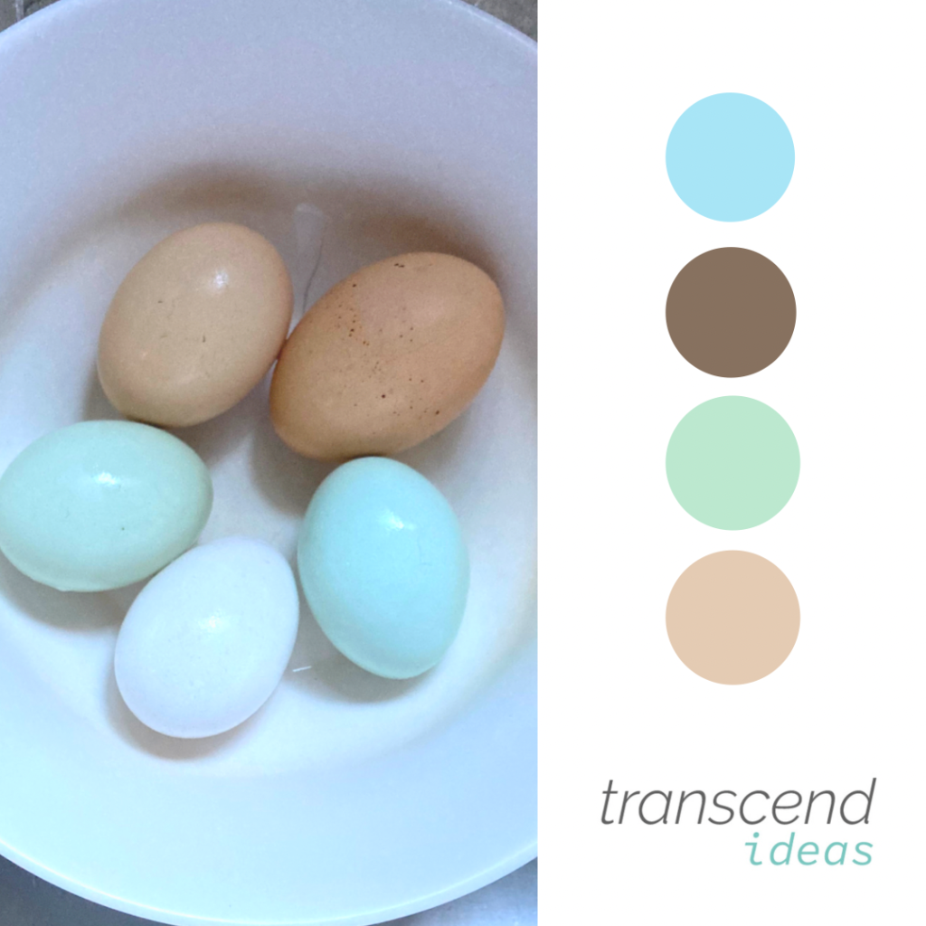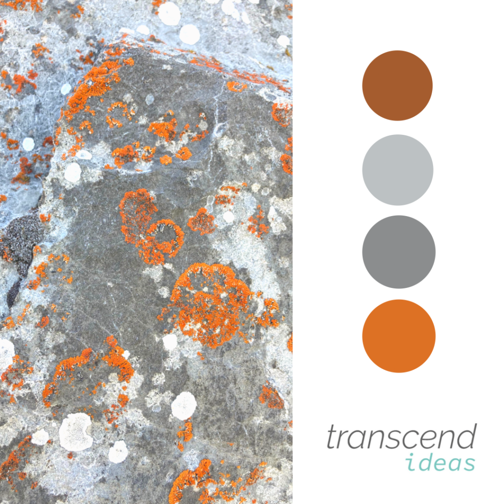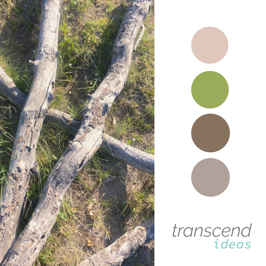
A large component of brand identity and discovery is choosing the color palette. Colors have meaning and some that we gravitate towards are quite a subconscious choice.
For Transcend Ideas, we utilized;
- Beige: unification
- Brown: stability
- Blue-green: calm, service
If you ask us, that is pretty spot-on.
We found some beautiful hues in nature that also tell a story of the energetic embodiment different color palettes can provide.
See the following link to describe Symbolism in colors

Brand Identity Process
When we begin working with a client on brand identity we first enter into discovery, read more here. After discovery, you enter into the logo variations. We urge our clients not to enter colors just yet because it could influence the choice of the logo itself. You may have heard the term “make it pop” and it’s quite literally what varying colors do, bring life and richness to the brand. Palettes can have their own emotional response they elicit, blues represent trust whereas red can represent excitement or anger. Color evokes an emotional response and can often influence a subtle change in your feelings and perceptions toward a company, from merely a logo or brand campaign alone.

If you like our approach signup for our newsletter or email hello@transcendideas.com for any questions on how we can help.
