Fonts tell us a lot about a brand, and there is much to discuss about them. We like to think that fonts have their own personalities, and they make a big difference in how consumers communicate with a brand. We could go on for a while, but we’ll try not to get too nerdy. We’re font fanatics here at Transcend Ideas.
Typography vs Fonts
Let’s start by clarifying the difference between typography and fonts. Typography is the art of arranging type to facilitate effective communication. While typography encompasses everything related to text, we are focusing on fonts in this discussion.
Font Vocabulary
To discuss fonts, it’s helpful to understand some of the important terminology you might hear surrounding fonts.
Typefaces: The visual designs that give characters their distinct style.
Fonts: The digital files that allow typefaces to be displayed on screens and in print. (Typefaces are what you see and fonts are what you use)
Weight: Refers to the overall thickness of the strokes in a typeface within a specific font. (ie. bold or regular)
Style: Regular, italic, oblique, and small caps are all examples of styles that can exist within a single typeface.
Font Family: If we consider a typeface to be the core design, then the different weights and styles could be said to be instances of that design, and together they form a family (or type family, or font family).
Definitions source via Google fonts. Learn more typography-related terms here.
Serifs vs Sans Serif
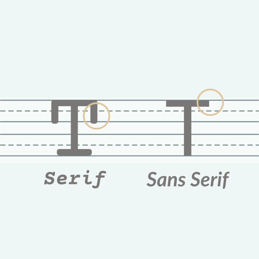
A serif is a small line or stroke regularly attached to the end of a larger stroke in a letter or symbol. Fonts are either serif fonts or sans serif fonts, with “sans” meaning “without” these strokes. For example, Times New Roman is a serif font, and Arial is a sans serif font. This text in particular is a sans serif font.
Typically, serif fonts make for an easier reading experience and work well in body text, especially at smaller sizes. Sans serif fonts tend to work well on signage where there is minimal text. However, there are exceptions, and serif and sans serif fonts can be paired within the same document to create a harmonious look.
Primary & Secondary Fonts
When selecting fonts for your brand, you should choose a primary typeface that reflects your overall brand identity. You should also select a secondary font that complements the primary font and helps create supportive documents. Sometimes, contrast is effective with a thicker primary font and a thinner secondary font or a serif paired with a sans serif. Other times, more subtle differences between the primary and secondary fonts can work well.
The Use of the Font
Consider the purpose of the font when choosing one. Is it for a logo, a newsletter, a graphic, or a flyer? Font use will vary depending on the content you are creating. For example, the controversial font Comic Sans tends to work well within a classroom setting, but using it for a funeral program would be deemed inappropriate.
Tone of the Font
The choice of font can come down to the tone you want to convey. How do you want to present your brand to your audience? A lot depends on the taste of the organization itself. For example, a bank will likely have different fonts than a flower shop. Is it important for your brand to be approachable? Formal and informative? Quirky and cool?
Accessibility
Another important aspect of fonts and typography is considering accessibility. Some fonts can be more difficult to read for individuals with intellectual differences and physical disabilities. Clarity, size, and contrast are crucial details to consider. In general, you want your fonts to be easy to read both up close and from a distance. Learn more about accessible design here. When we design inclusively, we widen our audience and extend the reach of potential customers.
Choosing the Right Font for Your Brand
Fonts significantly influence how customers and viewers perceive your brand. A poor font choice can lead to embarrassing consequences. Many problematic fonts are overused—looking at you, Papyrus. With a bit of knowledge and careful observation, you can avoid these mistakes. A carefully selected font can make an immeasurable impact on your brand’s perception. Finding the right font takes time, knowledge, and experience. Often, it also requires some typography work from a graphic designer to make it truly shine.
Feeling Overwhelmed?
We get it, there’s an overload of information out there on fonts and so many to choose from. Take a deep breath and reach out to us to help with your design. There is a difference between a designer’s perspective and a client’s perspective. With clear communication between the two, the perfect font is out there waiting to be put to use.